Most influential designers #2 Paula Scher

This is the ninth part of a ten-part blog series, if you’re looking to start from the beginning, go here.
Who is Paula Scher?
The only lady graphic designer to appear on this list and another New Yorker, Paula Scher is the principal partner at Pentagram, one of the worlds leading and according to this list, the most inspirational design firm in the world.
Paula Scher began her working career after graduating from Tyler School of Art with a bachelors degree in illustration. She moved to New York City to look for work and began her first job as a layout artist for the Random House children’s book division. After 2 years she obtained her first significant role at CBS Records (now Sony). At CBS Paula would churn out over 150 album covers a year, Paula herself admits that ’90% of them were bad’ which she goes on to explain was a good experience.
Wikipedia lists some of the most successful album cover designs she created during this time: Boston (Boston), Eric Gale (Ginseng Woman), Leonard Bernstein (Poulenc Stranvinsky), Bob James (H), Bob James and Earl Klugh (One on One), Roger Dean and David Howells (The Ultimate Album Cover Album) and Jean-Pierre Rampal and Lily Laskin (Sakura: Japanese Melodies for Flute and Harp).

In 1982, Scher left CBS to work on her own graphic design projects and in 1984 she partnered up with fellow Tyler graduate Terry Koppel to form Koppel & Scher. During the six years of their partnership, she produced identities, packaging, book jackets, and advertising, including the famous Swatch poster based on previous work by Swiss designer Herbert Matter.

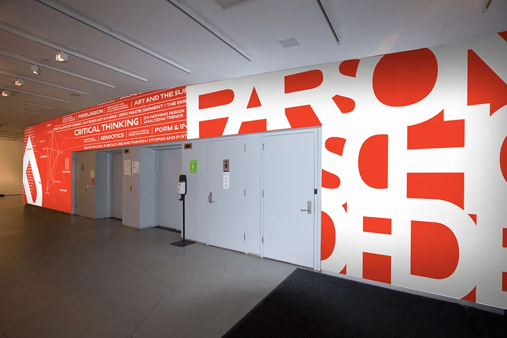
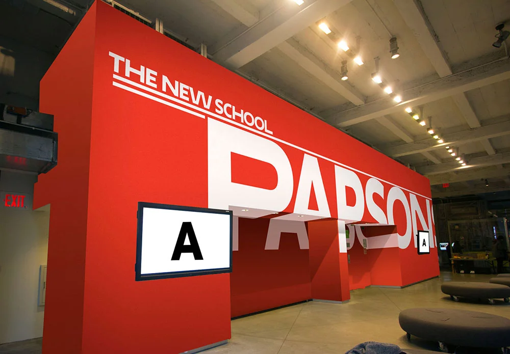
In 1991 Scher joined Pentagram as a partner, where she has created some of her most iconic works. Scher’s work is recognisable, mostly, by its emphasis on and style of typography. Often, I would say, misplaced in the category of Post-Modernism. Scher herself describes this distinguishing feature of her work to be influenced by her environment. New York City is tall, big, loud and in your face, elements present in almost all of her distinguishing works.
Contradictory to those who would put Paula in the design school of Post-Modernism, her work mostly makes use of grid systems, a principle outlined by Modernist legend Joseph Müller-Brockman and focuses heavily on direct and clear communication of an idea or theme. The Post-Modernists rejected the clean, simplistic overuse of Helvetica and the corporate ‘big-wiggery’ of the United States at the time. Paula supports this, claiming that Helvetica and the corporate style of design was the face of the Vietnam war, which Paula was very much against.
Having started in the early 70′s, Scher’s creative career has lived through the Post-Modernism age, her work contains elements that could be argued to be within that genre but ultimately, it transcends its boundaries. Some describe the period of art and design were currently in as ‘Neo-Modernism’ and Scher’s work certainly resembles some of the ideals of that category. She uses elements of playfulness and expressive type but does not allow it to obscure or conflict with the message. Her work in my opinion is a logical creative progression of the field that embraces its own history and respects current trends.
Paula Scher poster work


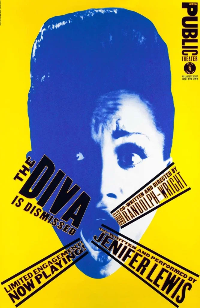
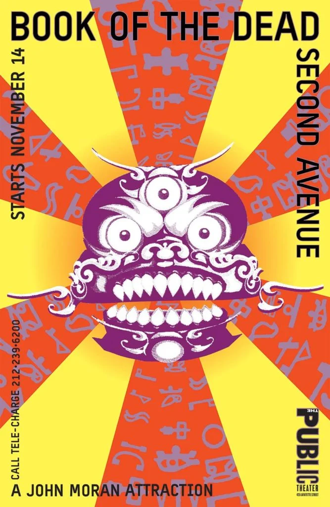
The Diva is Dismissed poster designed by Paula Scher for The Public Theater, 1994 Book of the Dead poster designed by Paula Scher for The Public Theater, 2000
Paula Scher typography

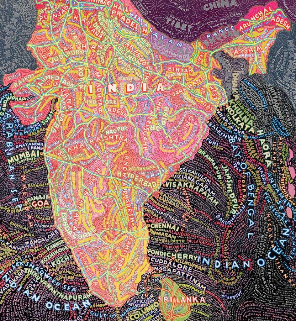
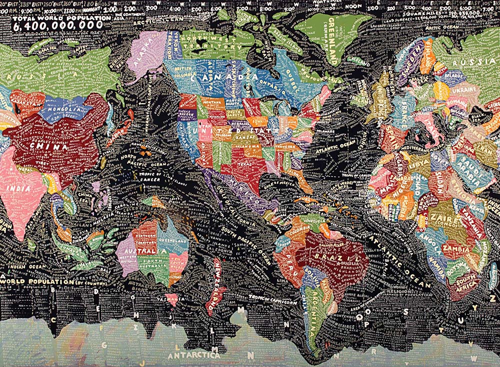
Paula Scher maps