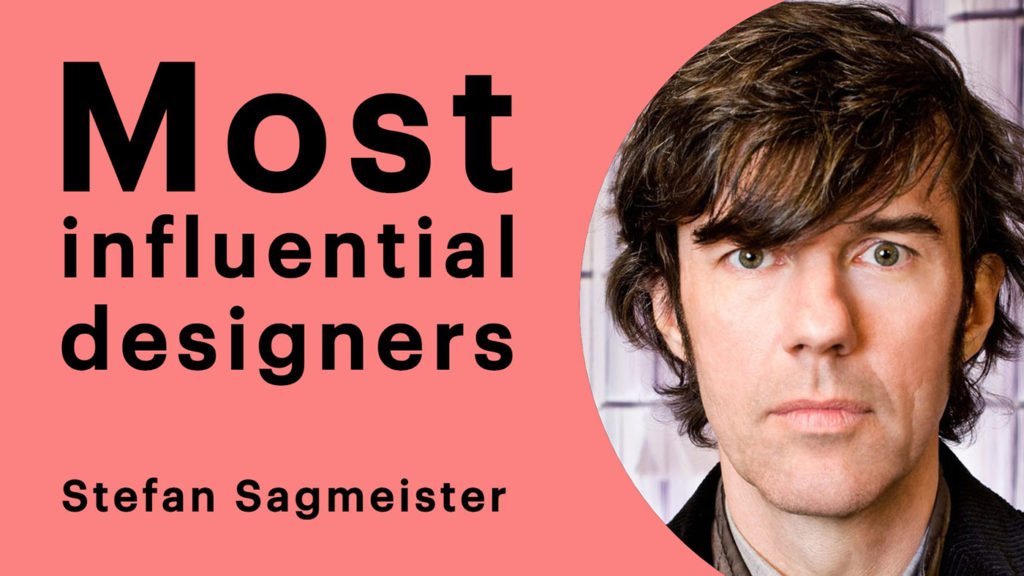
Most influential designers #1 Stefan Sagmeister
This is the final part of a ten-part blog series, if you missed the first part, read it here. As part of their 50th-anniversary survey GDUSA published a top ten list of the most influential graphic designers working today (amongst other creative professions).
I’m going to work, in reverse order, through these top ten designers and establish just what it is that makes them so damn great and more importantly display some of their best works.
Who is Stefan Sagmeister?
In total contrast to number 3 on the list David Carson, I’ll have to try my best not to let my love for Stefan’s work obscure meaning and remain unbiased with a view to presenting a fair and clear picture of the Sagmeister success story.
Stefan is a designer, studio director, entrepreneur, artist, typographer, published author, educator and all-around art and design hero. According to the internet, the Austrian-born designer started his career at the tender age of fifteen, whether or not we can trust this statement is sketchy at best. In fact in his TED Talk ‘The Power of Time Off’ (below) Sagmeister describes his working career as starting at 25.
Stefan certainly however had a keen interest in design from an early age. This early participation in the industry at Alphorn, an Austrian magazine for young people, will have surely laid the path for the successful academic pursuits that followed. Unfortunately, this did not happen immediately, his first application at the undergraduate level to The University of Applied Arts, Vienna was rejected.
“Just about everybody was better at drawing than I was”.
Stefan Sagmeister
He enrolled in a local private school and was later accepted at the University. During this time Stefan worked on posters for the Schauspielhaus theatre group as part of the Gruppe Gut collective.
His style at the time did not represent his current methods, humour, nudity and borderline inappropriateness weren’t present until he moved to New York due to receiving a Fulbright Scholarship based on the merits of his work enabling him to continue his study at the Pratt Institute in Brooklyn. Sagmeister, in this period, famously designed business cards ‘that cost only a dollar’ as they were printed on a one-dollar bill.

Austria, at the time, was one of the few European countries with mandatory military conscription. Typically within the art and design world, Stefan was objectionable toward this idea and managed to serve his time contributing to community work in a refugee camp near Vienna. Following this period Sagmeister stayed in Vienna working as a graphic designer.
In ’91, Stefan moved to Hong Kong to work with Leo Burnett, the ad agency was looking for a typographer at the time:
“So I made up a high number and said I would do it for that.”
Stefan Sagmeister
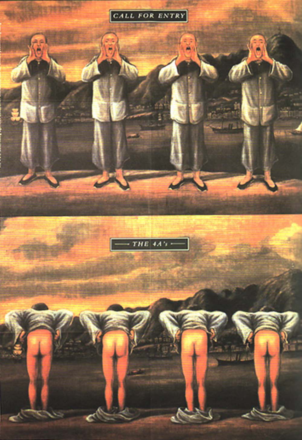
One year later, Stefan famously designed a poster for the 4As Advertising Awards Ceremony, the poster featured a traditional Chinese image with four men showing their behinds. Stirring significant controversy with some ad agencies even pulling out of the ceremony entirely, Stefan’s favourite complaint read:
“Who’s the asshole who designed this poster?”
In ’93 Sagmeister decided to move to Sri Lanka and work from a beach hut, this only lasted two months before the design magnetic field of New York City got the better of him and pulled him back, halfway around the world.
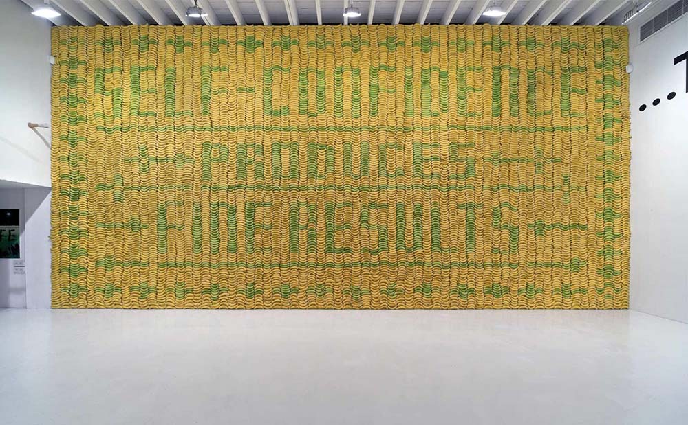
As a student, Stefan had greatly admired the work of Tibor Kalman and subsequently had a great ambition to work at M&Co, Tibor’s world-famous studio. Stefan bombarded the company with calls and correspondence until they’d support his visa application. Interestingly here, Sagmeister’s first project was to design an invitation for a gay and lesbian task-force gala. He designed a large basket of fruit which notoriously caused M&Co staff a huge headache attempting to prevent the thing from rotting.
Perhaps an early incarnation of the idea for his ‘Self Confidence Produces Fine Results’ piece which Sagmeister fans will no doubt be familiar with. M&Co was closed just two months later when Tibor moved to Rome to work exclusively on Colors magazine.
Stefan Sagmeister founded Sagmeister, inc. Kalman had advised he keep his company small, just Stefan, a designer and an intern. A principle, though not to such an extreme, Stefan still swears by.
Like many small studios, building a recognisable presence started with a strong visual identity—something today’s businesses often achieve through intentional web design.
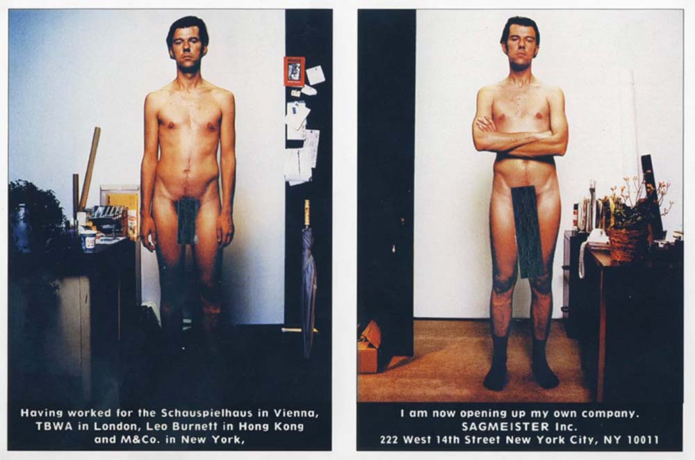
In the early days, Sagmeister had intended to exclusively work on design for music projects and more specifically, for music he liked. However, any designer, freelancer or creative professional reading this will know, that we don’t always get what we want when it comes to these things. His second project following branding his own company was branding his brother’s company, an Austrian jeans label named ‘blue’. Sagmeister, of course, designed a black and orange logo.
Unsuccessful in seeking his desired work through traditional sourcing avenues, Stefan settled for designing the cover for his friend’s album. ‘Mountains of Madness’ by H.P Zinker. The album went on to win the first of Stefan’s 4 grammy nominations, it featured a picture of a depressed-looking man but when the red transparent sleeve was removed, the image became a detailed green and red image of the same man screaming. The concept was inspired after Sagmeister spotted a young dyslexic girl using a transparent red sheet to assist her with reading her maths textbook.
A similar concept was later featured in the Peter Hall book ‘Made You Look’ about and designed by Sagmeister.

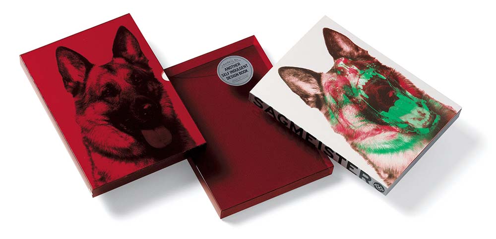
Winning a Grammy for album packaging design is a sure-fire way to open the floodgates to some very exciting music-based design projects. Stefan had really hit the nail on the head with the Mountains of Madness cover, in a time that was seeing the changeover from the brilliant art platform that was vinyl to the toy-like plastic-y ugliness of CD. The following years are undeniable proof of this with clients like Lou Reed, David Byrne and The Rolling Stones knocking at the door.

Since these works, as one can imagine, Sagmeister, inc. went from strength to strength. He did not stick entirely to his mission statement of only producing work for music that he liked but that is not to say he’s not picking and choosing his projects.
Almost everything Stefan Sagmeister works on is, in my opinion, a brilliant project, not just from a design perspective but from artistic, environmental, economical and social perspectives. His website states:
“We want the product or service to be worthwhile, i.e. have a reason to exist. …. We want to work with kind people.”
Since Mountains of Madness, Lou Reed, David Byrne and The Rolling Stones Sagmeister has worked commercially, on personal and cultural projects for clients including Aishti Department Stores, Levis, HBO Studio productions, Toto, AutoDesk, Adobe, BBH ad agency, Publicis ad agency, IDEO, Red Bull, BMW, Institute of Contemporary Art Philadelphia, Guggenheim Museum, Casa da Musica, NYC, Olympic committee, Museum of Modern Art, AIGA, Random House Publishing, Seed Magazine, The New York Times, .copy Magazine, NYTimes Magazine, Columbia University, School of Visual Arts, Massachusetts Institute of Technology, Rhode Island School of Design, Lou Reed/Sister Ray Enterprise, Universal Music/Jay-Z, Warner Brothers Records Inc, Atlantic Records, Rhino Records, David Byrne/Brian Eno, Capitol records, One Voice and Azuero Earth Project.
A massive contributory factor to Sagmeister’s success, however, is his personal projects, they allow us to have a deep insight into his mind. Sure a great designer will express some of their own opinions and ideas through all of their work, but most don’t really open up in the same way that Sagmeister does. His ‘Things I have Learned in My Life So Far’ series and the book by Peter Hall, subtitled ‘Made You Look’ containing dozens of exerts from Stefan’s diary are incredibly honest, open and transparent.
Stefan Sagmeister Posters
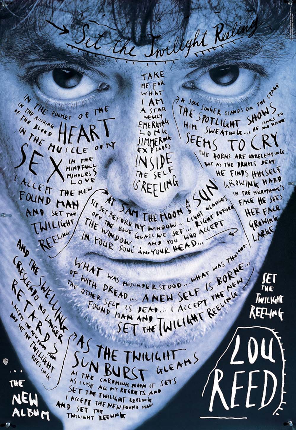


Sagmesiter’s work clearly has a definitive style, having said this each work is vastly distinguishable, a designers dream quality to say the least. He enjoys his work, is very opinionated on the field of graphic design and openly embraces every aspect of his life and the world around him in his work, he is open, honest and human. We see his mistakes, his low points as well as the astonishing highs of his works.
It’s difficult to pinpoint just one element that is responsible for his success, but if I had to pick one it would be the persona that is Sagmeister, I’ve never met Stefan, but I feel as though I know him inside out, my idea of him maybe entirely wrong but his greatest design achievement isn’t that of music packaging, nor a great poster, it’s branding. Branding himself.
