Understanding Colour Theory in UI Design
Do you sometimes struggle with choosing the right colours for your user interface designs? Colour theory is a fundamental aspect of design that can make or break the success of your UI. Understanding the psychology of colour and how they interact with each other is crucial for creating effective and visually appealing user interfaces. In this blog post, we will delve into the world of colour theory in UI design, and provide you with the knowledge and tools to create designs that resonate with your audience.
When it comes to UI design, choosing the wrong colours can have negative implications on user experience, while choosing the right colours can positively impact user engagement and satisfaction. By understanding the meaning behind different colours, their emotional impact, and how they work together in a design, you can create UIs that effectively communicate your brand’s message and resonate with your target audience.
Key Takeaways:
- Colour psychology: Understanding the psychological impact of different colours is crucial in UI design as it can evoke specific emotions and influence user behaviour.
- Colour wheel: Familiarising with the colour wheel helps in creating harmonious colour schemes and understanding colour relationships for better visual hierarchy in UI design.
- Contrast and accessibility: Considering contrast and accessibility is important to ensure that text and visual elements are easily discernible for all users, including those with visual impairments.
- Branding and personality: Using the right colours can help to convey a brand’s personality and create a strong visual identity in UI design, influencing user perception and recognition.
- Consistency and usability: Maintaining consistent use of colours across a UI design ensures cohesive user experience and facilitates usability by providing visual cues and organisation.
The Basics of Colour Theory
When it comes to being a great UI designer, understanding the principles of colour theory is essential. The right choice of colours can enhance the user experience, while the wrong one can lead to confusion and frustration. In this chapter, we will look at the basics of colour theory and how it applies to UI design.
Defining Colour: Hue, Saturation, and Value
Colour is defined by three main characteristics: hue, saturation, and value.
- Hue is the purest form of a colour and is what distinguishes one colour from another.
- Saturation refers to the intensity or purity of a colour, with fully saturated colours being the most intense.
- Value, on the other hand, refers to the lightness or darkness of a colour.
Understanding these three characteristics is crucial when selecting and combining colours for your UI design, as they will determine the overall look and feel of your design.
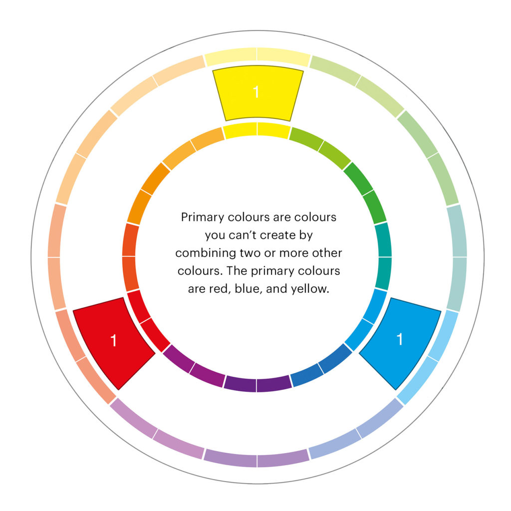
The Colour Wheel: Primary, Secondary, and Tertiary Colours
The colour wheel is a fundamental tool in understanding colour theory. It consists of primary colours (red, blue, and yellow), which cannot be created by mixing other colours, and are used to create all other colours.
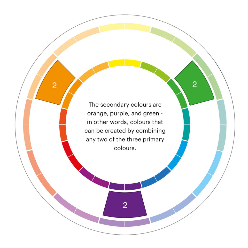
By combining primary colours, you get secondary colours (green, orange, and purple). These colours are made by mixing two primary colours together.
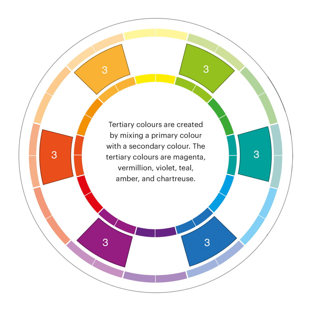
Finally, by combining primary and secondary colours, you get tertiary colours (red-orange, yellow-green, etc.), which are mixtures of a primary and a neighbouring secondary colour on the colour wheel.
Colour Temperature
Whether you’re just beginning to explore the world of UI and UX design or are well-versed in the field, the concept of colour temperature is a critical element in colour theory that you are likely familiar with. Colour temperature categorises colours into three distinct groups: warm, cool, and neutral.
Warm colours are characterised by their yellow and red hues, evoking a sense of vibrancy and dynamism. In contrast, cool colours, with their blue, green, or purple undertones, exude tranquility and serenity. Neutral colours, such as brown, grey, black, and white, offer a balanced and versatile palette.
The chosen temperature of a colour profoundly influences our psychological and emotional reactions. For instance, warm colours are often associated with feelings of enthusiasm, positivity, and innovation, while cool colours are linked to notions of serenity, relaxation, and balance.

Psychology of Colours in UI Design
Understanding the psychology of colours in UI design is essential for creating effective visual experiences for your audience. Each colour has its own unique psychological impact, and incorporating these principles into your design can significantly enhance the user experience.
Studies undertaken by the Institute for Colour Research indicate that individuals form a subconscious evaluation of a product within the first 90 seconds of exposure. Remarkably, 62% to 90% of this initial assessment is attributed solely to the product’s colour.
Emotional Impact of Colours
Colours evoke different emotional responses from people, and understanding this can help you make deliberate design choices. For example, red is often associated with passion, energy, and urgency, making it a popular choice for call-to-action buttons. On the other hand, blue is known for its calming and trustworthy qualities, making it suitable for finance or healthcare apps. Take into account the emotional response you want to evoke from your users and choose your colour palette accordingly.
Choosing the Right Colours for Your Audience
When selecting colours for your UI design, it’s crucial to consider your target audience. Different demographics and cultures have varying perceptions of colour. For example, while white is associated with purity and cleanliness in Western cultures, it symbolises mourning in some Eastern cultures. Your choice of colours should resonate with your target audience and align with their preferences and cultural associations.
Moreover, consider the gender and age of your audience. Research has shown that men and women perceive colours differently, and preferences may change with age. Tailoring your colour choices to your specific audience can help create a more engaging and relatable user experience.
Colour Schemes and Their Uses
Understanding different colour schemes and how to use them effectively in UI design is crucial for creating visually appealing and functional interfaces. By carefully choosing and combining colours that work in harmony, you can enhance the user experience and convey the right message to your audience.
Monochromatic Color Scheme
When using a monochromatic colour scheme, you are working with variations of a single colour. This can create a sense of harmony and simplicity in your design. Because all the colours come from the same base hue, they naturally complement each other. This makes it easier for you to create a cohesive and unified look. However, using too many similar shades can also make your design appear monotonous. It is important to utilise different tints, shades, and tones to create depth and contrast in your design.
Analogous Color Scheme
Analogous colour schemes involve using colours that are next to each other on the colour wheel. This creates a sense of harmony and is pleasing to the eye. By using this scheme, you can create a design that feels unified and balanced. However, if you rely too heavily on analogous colours, your design can lack visual interest and become monotonous. It is important to introduce contrast by using different hues, tints, or shades to avoid a flat appearance.
Complementary Colour Scheme
A complementary colour scheme involves using colours that are opposite each other on the colour wheel. This creates a high contrast and vibrant look in your design. By using complementary colours, you can create a dynamic and visually striking interface. However, it is essential to use complementary colours sparingly and balance them with neutral tones to avoid overwhelming the user and causing visual fatigue. You can also use tints and shades of the complementary colours to create a more subtle and harmonious design.
Triadic Color Scheme
A triadic colour scheme involves using three colours that are evenly spaced around the colour wheel. This creates a balanced and vibrant look. By using a triadic colour scheme, you can create a design that is visually interesting and dynamic. However, using three bold and vibrant colours in equal measure can make your design appear overwhelming and clash. It is important to choose one dominant colour and use the other two as accents or for smaller elements in your design.
Tetradic Color Scheme
A tetradic colour scheme involves using four colours that are evenly spaced around the colour wheel. This provides a lot of variety and allows for a wide range of color combinations. By using a tetradic colour scheme, you can create a vibrant and diverse design. However, using four distinct colours can be challenging to balance, and it’s essential to choose one or two dominant colours and use the others as accents to avoid a chaotic or overwhelming design.
Accessibility and Colour Contrast
When designing a user interface (UI), one of the most crucial aspects to consider is the accessibility of your design. This includes ensuring that all users, regardless of any visual impairments e.g. colour blindness, can easily and comfortably interact with your product. Colour contrast plays a significant role in achieving this accessibility. It affects the readability and usability of the interface, making it essential for you to understand how to implement effective colour contrast in UI design.
Understanding Web Content Accessibility Guidelines (WCAG)
Web Content Accessibility Guidelines (WCAG) are a set of recommendations for making web content more accessible. These guidelines provide specific criteria for ensuring colour contrast, ensuring that your design is accessible to users with various visual impairments. WCAG emphasises the importance of a minimum contrast ratio between text and its background, as well as between different elements on the page. By following these guidelines, you can ensure that your UI/UX design is inclusive and accessible to all users.
Tools and Techniques for Testing Colour Contrast
There are several tools and techniques available to help you test the colour contrast of your UI design. These tools allow you to analyse the contrast ratio of your colour combinations and ensure that they meet the WCAG requirements. You can use online tools such as WebAIM’s Contrast Checker and Colour Contrast Analyser to analyse the colour contrast of your design.
Additionally, you can also use browser extensions and plugins to test the contrast directly within your design environment. By utilising these tools and techniques, you can ensure that your UI design meets the necessary colour contrast standards, ultimately making it more accessible to all users.
Applying Colour Theory to UI Elements
When it comes to applying colour theory to UI design, it’s essential to understand how different colours can impact user experience and functionality. By incorporating the principles of colour theory into your UI elements, you can create visually appealing and user-friendly interfaces. To further your understanding of colour theory and how to use it effectively in UI design, be sure to check out the following resource:
Text and Background Colour
When it comes to text and background colour, it’s important to consider both readability and aesthetic appeal. Choosing the right combination of colours can make your content easy to read and visually engaging. Your text needs to stand out clearly against the background, so consider using a high-contrast combination to ensure readability. For instance, black text on a white background is a classic choice for good reason, as it provides optimal contrast and legibility.
Buttons and Call to Actions
Buttons and call to actions are crucial elements in any UI design, as they guide users through the interface and encourage interaction. The colour of your buttons can significantly impact user behaviour, so it’s essential to choose wisely. Bright, eye-catching colours can draw attention and prompt action, while more neutral tones can create a sense of balance and professionalism.
Consider the psychological impact of different colours when crafting your call to actions, as colours can evoke specific emotions and responses from users.
Icons and Imagery
Icons and imagery play a vital role in visual communication within a UI. The colours you choose for your icons and imagery can help convey meaning and enhance user understanding. Pay attention to the colour psychology when selecting hues for your icons, as different colours can evoke various associations and emotions.
Consistency in colour choice for icons and imagery can also create a cohesive and harmonious visual experience for the user, contributing to overall usability and aesthetics.
Forms and Input Fields
Forms and input fields are essential components of most UI designs, and the colours used in these elements can impact user interaction. By using subtle variations in colour for input fields, you can distinguish different types of information and create a more intuitive user experience.
Consider using colour indicators or highlights to draw attention to required fields or to indicate errors, helping users navigate the form efficiently. Remember to also consider accessibility in your colour choices, ensuring that all users can easily interact with your forms.
Trends and Best Practices
Understanding the current trends and best practices in colour usage is crucial for effective UI design. By keeping up with the latest trends, you can ensure that your designs are modern and visually appealing, while adhering to best practices will help you create designs that are user-friendly and accessible to a wide audience.
Current Trends in UI Color Usage
One of the current trends in UI colour usage is the use of bold and vibrant colours to create eye-catching designs. This trend is particularly prevalent in mobile app design, where bright colours are used to capture the user’s attention and create a memorable user experience. On the other hand, minimalistic designs with a limited colour palette are also gaining popularity, conveying a sense of sophistication and simplicity.
Do’s and Don’ts of Colour in UI Design
When it comes to using colour in UI design, there are certain do’s and don’ts to keep in mind. Do consider the psychological impact of colours and how they can influence user behaviour. Use colours strategically to evoke certain emotions or guide the user’s attention. Don’t overwhelm your design with too many bright or clashing colours, as this can distract and confuse the user.
Final Thoughts on Colour Theory in UI Design
Ultimately, understanding colour theory in UI design is crucial for creating visually appealing and effective user interfaces. By grasping the principles of colour psychology, colour harmonies, and the roles of different colours, you can better communicate with your users and evoke the desired emotions and actions. This knowledge allows you to make informed decisions when selecting a colour palette for your UI designs, ensuring that your choices are not only aesthetically pleasing, but also meaningful and impactful.
By applying the principles of colour theory in your UI design work, you can create more effective and enjoyable user experiences. With a deeper understanding of how colours interact and influence perception, you can strategically leverage colour to guide user attention, create visual hierarchy, and establish a consistent brand identity. By incorporating these insights into your design process, you can boost the overall usability and effectiveness of your user interfaces, ultimately leading to more satisfied users and improved business outcomes.