Mastering White Space in Web Design

Did you know that roughly 38% of website visitors will stop engaging with a website if the content or layout is unattractive? With so much competition online, it’s crucial to create a visually appealing and user-friendly website to keep visitors engaged and improve conversions.
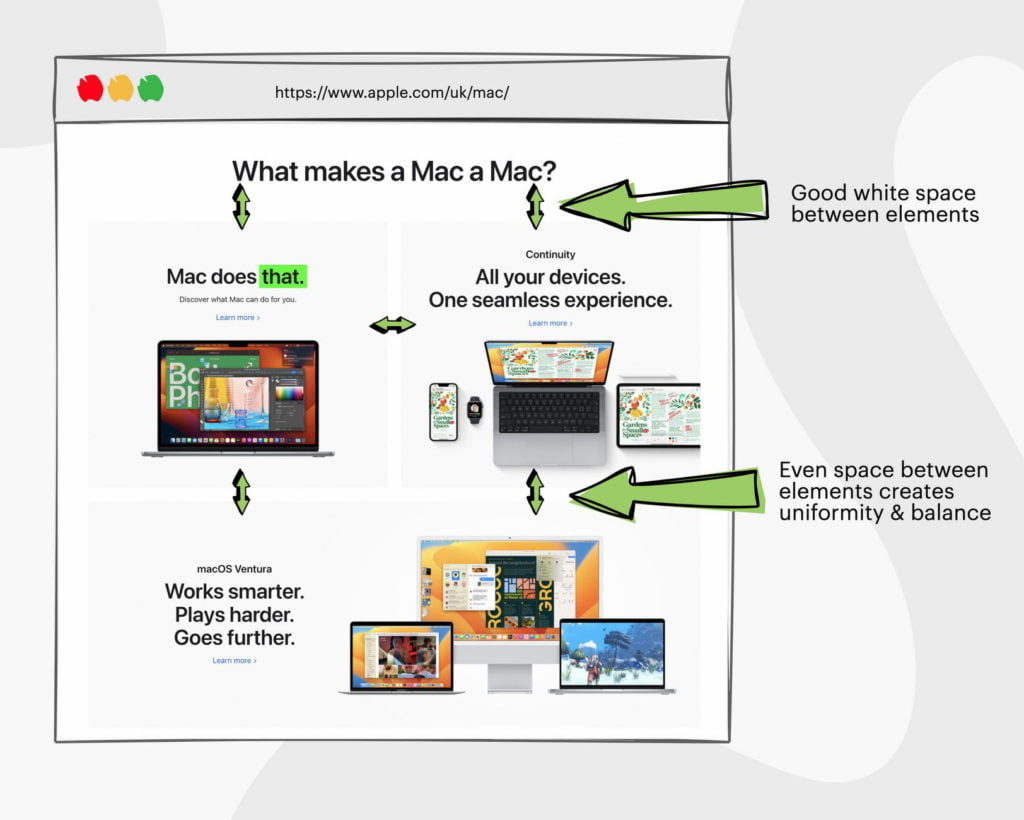
One element of web design that can make a significant impact on the user experience is white space. In this article, we’ll explore what white space is, its importance in web design, and how to use it effectively to create an attractive and organised website that engages visitors.
What is Whitespace?
White space, also known as negative space, refers to the empty areas around content and design elements on a web page. It can be divided into micro and macro white space, and passive and active white space.
While some may see white space as wasted space, it’s actually an essential element of web design that can improve the legibility, readability, and overall UX of a website.
Where Did White Space Come From?
White space has been used throughout the history of design, with its origins traced back to ancient manuscript design. Monks and scribes used white space to create separation between different blocks of text, making the manuscripts easier to read.
In the early days of printing, white space was used sparingly due to the high cost of paper. However, with the rise of modernist design in the 20th century, white space became a defining feature of minimalist design.
Designers such as Dieter Rams and Massimo Vignelli embraced the use of white space, making it a key element of their design philosophy.
“Almost all the great American graphic designers have used white space as the significant silence to better hear their message loud and clear.”
Massimo Vignelli
Today, white space remains a popular design technique across a range of mediums, including print, mobile, and web design. Its ability to improve visual clarity and create a sense of elegance and sophistication has made it a staple of modern design.
Types of Whitespace
Passive and active white space, as well as micro and macro white space, are important subtopics to consider when discussing types of whitespace in website design.
Passive white space refers to the natural gaps that occur in design or typography, while active white space is intentionally added to guide a visitor’s eyes down the page or through a process.
Micro white space refers to the smaller gaps and buffers built around content, while macro white space refers to larger areas devoid of content.
Passive vs. Active White Space
You can guide your website visitors’ eyes and create a seamless UX design by intentionally adding empty areas to your page, known as active white space.
Unlike passive white space, which occurs naturally in design or typography, active white space is a deliberate addition to a website’s layout to improve its balance and flow.
It can be used to create visual hierarchy, emphasise certain elements, and direct users towards important calls to action.
Active white space can be a powerful tool when used correctly, but it’s important to keep in mind that too much of it can impair the legibility and usability of a site.
It’s all about finding the right balance between content and space, and using spacing strategically to improve the overall design. When adding active white space to your website, it’s important to consider the spacing around letters, words, and paragraphs, as well as the spacing around content or its container.
By doing so, you can create a visually appealing website that not only looks great but also makes your content a pleasure to read.
Micro vs. Macro White Space
Finding the right balance between the small gaps and larger areas that are devoid of content, known as micro and macro white space respectively, is crucial for creating an effective and visually appealing website that doesn’t leave visitors feeling like they’re looking for a needle in a haystack.
Micro white space is the negative space within or between visual elements such as letters, words, and paragraphs. Ample spacing around these elements can ensure that content is easily readable and doesn’t overwhelm the visitor.
On the other hand, macro white space is the larger negative space in the background of a website.
It can provide the perfect balance between content and space and ensure that the website doesn’t appear cluttered or confusing.
Macro white space can be used to create a visual hierarchy and guide the visitor’s eye towards elements on a website that are important.
By using both micro and macro white space effectively, a website can provide a seamless and engaging user experience that keeps visitors coming back.
What is the importance of white space in web design?
White space is a crucial tool in structuring and organising content in web design. It draws focus on key elements, such as CTAs, and improves text readability and legibility.
By making websites easier to use and creating a sense of elegance, white space can make your website “feel right” to your end user.
It structures and organises content
When structuring your website’s content, incorporating white space can help organise and visually separate different elements, making it easier for visitors to navigate and digest information.
Without adequate white space, your designs can appear cluttered and overwhelming, leading to a negative experience for the end user.
By introducing blank space around your content, you can create a clear hierarchy of information, guiding users through your website and highlighting key messages.
One way to effectively incorporate white space in design is to group similar content together and separate it from unrelated elements. For example, space could be used to separate your website’s header from its main body, or to create specific sections for different types of content.
This not only makes your site easier to navigate, but also helps to improve its overall aesthetic. When used correctly, white space can give your website a clean, modern look, while also improving its usability and functionality.
It draws focus on important elements
You may not realise it, but incorporating enough blank space around certain elements on your website can increase their visibility by up to 20%. This is because white space draws focus to the design element, making it stand out from the surrounding content blocks.
As a designer, it’s important to understand how to use space between elements and around them to create a visual hierarchy on your design project.
When you have a lot of information to present on a web page (often on the homepage), it can be tempting to cram everything together to save space. However, this approach can make the page feel cluttered and overwhelming to users.
By strategically implementing white space, you can make the page feel more balanced and give users a clear path, in order to help guide the user. For example, if you have a CTA (call-to-action) button that you want users to click, placing it in a section with ample white space around it will draw attention to the button and make it more likely that users will click on it.
It improves text readability and legibility
By incorporating enough blank areas around your text, it becomes easier to read and comprehend for visitors. This is because white space creates a visual break that allows the eyes to rest and focus on the text.
When there is plenty of white space around the text, it becomes easier to distinguish each line, word, and letter. This is particularly important for websites that have a lot of content, as it can become overwhelming for visitors to read if there is no visual break.
In addition to the amount of white space, letter spacing is also important for improving text readability and clarity.
By increasing the spacing between letters, the text becomes more legible and is essential for accessibility standards. This is because the increased spacing helps to separate each letter, making it easier for the eyes to distinguish them.
When letter spacing is too tight, the letters can blend together, making it difficult for visitors to read and comprehend the text. Incorporating enough white space and letter spacing can significantly improve the overall readability and legibility of your website’s text.
It makes websites easier to use
When a website has ample white space, it becomes more visually appealing and less cluttered, making it easier for users to navigate. This is because white space can help guide a user’s eye towards important elements on the page, such as calls to action or important information.
White space can also improve a user’s click confidence and accuracy. This is because when elements on a page are spaced out and given room to breathe, users are less likely to accidentally click on the wrong button or link.
This can lead to a more positive user experience and can ultimately improve a website’s conversion rates. Through the correct implementation of white space design, web designers can create a website that not only looks great, but is also easy to use and navigate.
Creates a sense of elegance
When it comes to creating a sleek and stylish website, adding a touch of sophistication with some ‘old school’ class creates a sense of elegance that can truly impress your target audience.
One way to achieve this is by using white space effectively. A website that is cluttered with images, text, and graphics can be overwhelming and difficult to navigate. On the other hand, a website that uses white space to create a sense of balance and harmony can be visually appealing and easy to use.
White space can be used to create a sense of elegance and sophistication by allowing the content and design elements to breathe.
It can be used to highlight important content, create visual interest, and improve the overall UX of the design. It can also be used to create a sense of luxury and exclusivity, as it suggests that the content and design elements are valuable and deserve attention.
When used correctly, white space can be a powerful tool in web design, creating a sense of elegance and sophistication that can truly impress your target audience.
Tips for Using White Space Effectively
Let’s talk about the best practices for incorporating white space in your designs. First, it’s important to consider visual hierarchy when positioning elements.
By using white space to group and separate elements, we can guide the user’s eye to the most important information. Second, grouping objects and content logically can help make the website easier to understand and navigate. Third, proper text formatting is key to ensuring readability.
And lastly, keeping the design clean and minimal can help achieve a balance between content and white space.
Consider visual hierarchy when positioning elements
Make sure you position your elements strategically with visual hierarchy in mind, so that visitors know exactly where to look first and what’s most important on your website.
Visual hierarchy refers to the arrangement of visual elements in order of importance, where the most important elements are given the most prominence. This is achieved through the use of size, colour, contrast, and positioning.
To create an effective visual hierarchy, start by determining the most crucial elements on your page and then make them stand out by using larger font sizes, bold text, and contrasting colours. Next, adjust the amount of space in your layout in order to separate these important elements from other content on the page. This can be done by increasing the amount of white space around the elements, or by using contrasting colours to create a visual break between them and other content.
By using visual hierarchy effectively, you can guide your visitors’ attention to the key elements on your page, improving their overall experience and increasing the chances of conversion.
Group objects and content logically
Now that we’ve talked about visual hierarchy, let’s move on to the next important aspect of using negative space in web design: grouping objects and content logically. This involves organising all the elements on your website in a way that makes sense to the user and enhances their browsing experience.
Grouping objects and content logically can be achieved through many techniques. One way is to experiment with white space to create visual separations between different sections of your site.
For example, you can use white space to separate your navigation menu from your main content, making it easier for users to find what they’re looking for. White space can also be used to group related content together, such as product descriptions and images, or to separate different steps in a checkout process.
By using white space to organise your website, you can help users navigate more easily and find what they’re looking for faster.
Implement proper text formatting
When you’re formatting text on your website, it’s important to consider the readability and legibility of your content so that users can easily understand what you’re trying to convey.
One way to achieve this is by implementing proper text formatting. This includes using sizes and styles that are easy to read, such as sans-serif fonts like Arial or Helvetica.
It’s also important to use a consistent font size throughout your website, to avoid any confusion or distractions for the user.
Another aspect of proper text formatting is using appropriate line spacing and paragraph breaks. This can greatly improve the user’s experience by making the content easier to read and digest.
It’s recommended to use a line spacing of 1.5 or 2, and to add a blank line between paragraphs to create a visual break. Additionally, using bullet points or numbered lists can help break up dense text and make it easier to scan for important information.
By implementing proper text formatting, you can ensure that your content is easily readable and engaging for your website visitors.
Keep the design clean and minimal
You want your website to be like a clean and organised closet, where everything has a place and there’s no clutter to distract from what’s important.
By keeping your design minimal and clutter-free, visitors can easily navigate and focus on the content that matters.
A clean design creates a sense of ease and simplicity, which is crucial to a well performing website. It also allows for ample white space, creating a balance between content and space that can make the website look more visually appealing and modern.
A minimal design doesn’t mean that you have to eliminate every element of your website. Instead, it means that you should approach your design with a critical eye, and only include what is necessary.
This includes using a limited colour palette, using readable fonts, and keeping your layout consistent. Remember, less is often more when it comes to web design. By keeping your design clean and minimal, you can create a website that is both visually appealing and easy to use for your visitors.
Conclusion: Use Whitespace To Build Better Websites
So, if you want to create websites that are easy on the eyes and effortless to navigate, incorporating whitespace is a must. Not only does it make your design more aesthetically pleasing, but it also helps improve the usability of your website.
By strategically placing whitespace around your content, you can guide visitors towards the most important information and make it easier for them to absorb and interact with your site.
Incorporating whitespace is not just about adding empty space to your design. It requires a thoughtful and intentional approach to ensure that it is used effectively.
By considering the hierarchy of your content, typography, and layout, you can create a design that incorporates whitespace in a way that enhances the user experience.
So, take the time to consider how whitespace can be used in your next project and see how it can help you create a website that stands out from the crowd.