A Brief History of Graphic Design
What is graphic design?
Graphic design is the process of creating visual communications for a variety of media including print, broadcast, packaging, packaging, packaging, etc. The primary purpose of graphic design is to communicate ideas and information in an attractive manner that will appeal to the target audience.
Early design history
The first signs of visual communication
It wasn’t until after the invention of the printing press around 1440 AD that graphic design really began to develop, but the origins of visual communication stretch all the way back to the Stone Age.
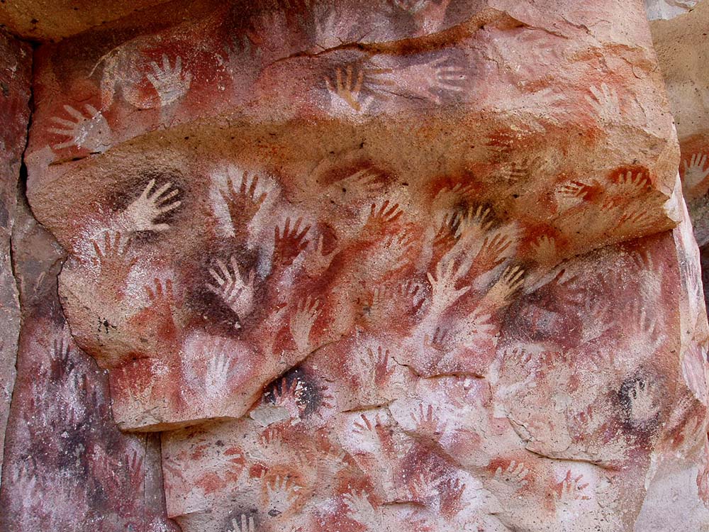
The earliest known examples of visual communication date back to around 3500 BC. These were cave paintings depicting animals and humans. They were done by people who lived in caves and used firelight to illuminate their drawings.
Graphic designers have been around since ancient times. They were often employed by kings and emperors to decorate buildings and monuments. In fact, some of the earliest known examples of graphic design come from Egypt, where they were used to illustrate religious texts.
The invention of printing
Around 1440 AD, Johannes Gutenberg invented movable type printing. This was a major leap forward from previous methods of producing books, which were laborious and slow. It allowed people to read at their leisure, rather than having to wait for monks to copy manuscripts by hand.
How the industrial revolution evolved graphic design
Graphic designers were often hired by printers who needed illustrations for books, magazines, newspapers, posters, and advertisements. As printing became increasingly automated, the demand for illustrators declined. In the early 20th century, many artists turned to commercial illustration to supplement their income.
Influential art movements and people in graphic design
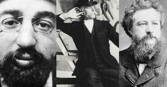
We start in late 18th, early 19th century France with a rather famous artist; Henri de Toulouse-Lautrec. Toulouse-Lautrec was an inbred alcoholic who died at the tender age of 36 shortly after being sent to a sanatorium. He is however commonly accredited ‘Inventor of the Modern Poster’ along with similar post-impressionist artists including Jules Chéret AKA ‘Godfather of the Poster’. ‘Post impressionism’ by the way refers to artists after Manet, a more traditional impressionist artist. Post impressionists still used real-world subjects, vivid colour & heavy brush strokes but tended to distort form and colour for expressive effect.
Though these artists are infinitely important with regards to the birth of graphic design, they cannot be held solely responsible. It was the industrial advancements made at the time such as printmaking & lithography that make graphic design what it is today. Ah, mass production what would we do without you?
Toulouse-Lautrec & Chéret may have been putting in all the hard graft back in the early days of graphic design but to them it was art. It wasn’t until William Morris an English textiles designer came along in 1891 that the term ‘Graphic Design’ was used. Morris ‘pioneered the distinction between fine art and graphic design’. Morris founded ‘The Kelmscott Press’ a major player in early British mass print production.
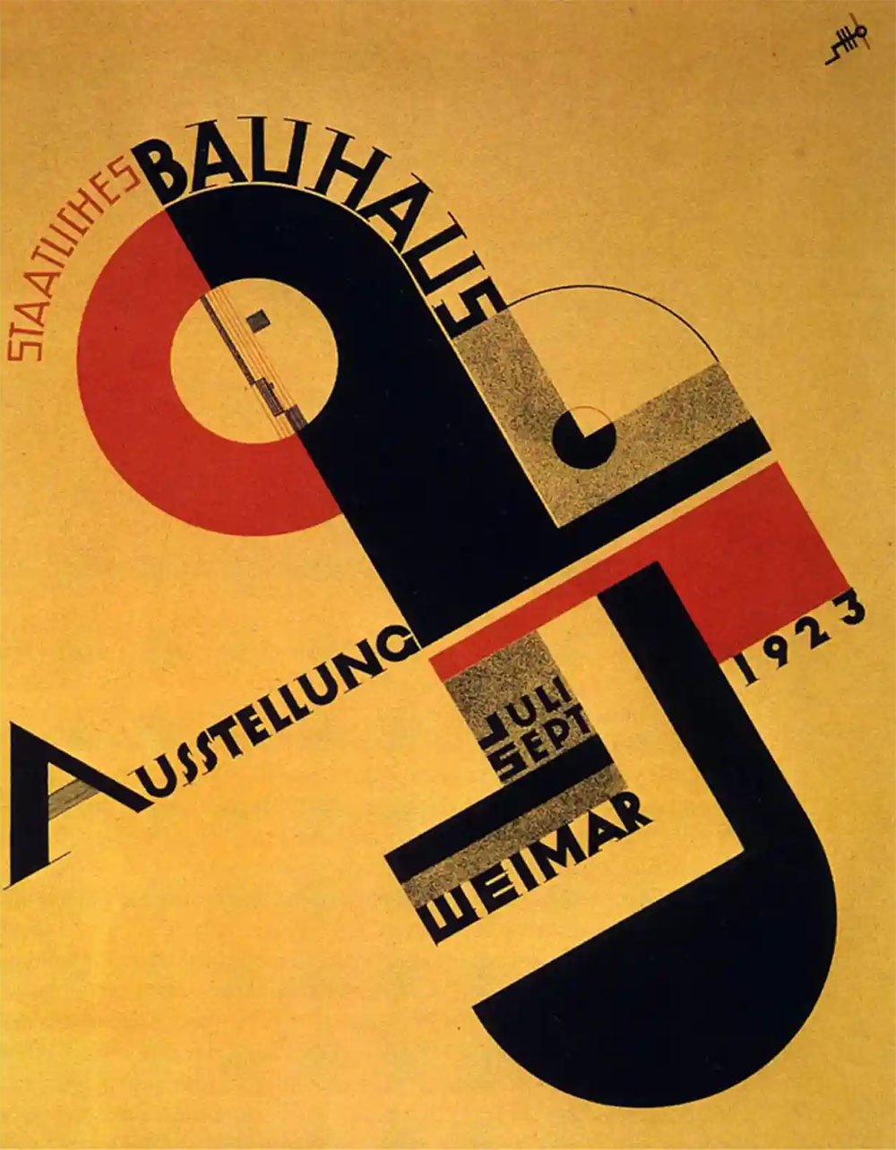
The Bauhaus Movement
The term Bauhaus is one of those terms that gets thrown around rather tediously. Anyone wanting to sound ‘creative’ or ‘arty’ has this term at their disposal. They are confident that anyone with enough patience to listen to them won’t understand its origins and they can walk away feeling all clever and ‘cool’.
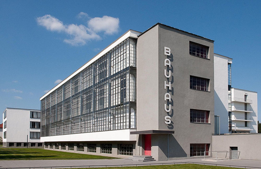
When you drive through Germany you see the word everywhere. Simply put it’s just German for ‘building school’. (literal translation: ‘House of Construction’.) However, the Bauhaus creatives and their wannabe friends are often referring to is Staatliches Bauhaus. Originally in Weimar and founded by architect Walter Gropius. Staatliches Bauhaus ironically didn’t originally teach architecture but rather a ‘total work of art’ in which all art subjects eventually including architecture would be taught together.
Modernism
This brings us to the term ‘Modernism’. Bauhaus was founded after the first world war and all the left-wing Germans at the time rejoiced, celebrating the end of the German monarchy and a hell of a lot of conservative censorship which brought an influx of experimentation within the arts.
While modernism had already made an impact it wasn’t until the radical thinking that went on in Bauhaus Weimar and its tendency toward functionality and simplification and its acknowledgement of mass production that modernism would really affect the way people lived.
But what does this all have to do with graphic design? Still relatively new at the time Bauhaus Weimar was the first place graphic design was taught as its own independent subject and due to its hugely revolutionary teachings and strong roots in modernist culture, Bauhaus, figuratively speaking, married the modernist movement and graphic design.
So modernism: design that’s fit for a purpose. No unnecessary bells and whistles, if it’s a chair, it’s a chair, if it’s a building, it’s big and square because that’s how you fit the most rooms in. And if it’s graphic design; it’s legible, simple shapes, bold & straight to the point. Google and Airbnb are great examples of modernist logos.
Naturally, as a graphic designer, I usually try to avoid cliche’s however in this case I feel this is the best way to sum up modernism. Two of the greatest cliche’s of modernism are “Form follows function.” This is actually a misquote about architecture, but a design cliche nonetheless and “Less is more”.
So next time someone says ‘I hate modern art, it could be done by children or monkeys’ you just keep quiet and smile knowing that almost every man-made object in that person’s life is a direct result of modernism, it was sold to them using modernist graphic design and they’re actually referring to contemporary, abstract or surrealist art.
Kandinsky – Basic Design & Advanced Theory
A late-blooming Russian artist who didn’t even pick up a paintbrush or pencil until the age of 30. Kandinsky is renowned in the art world as being the first-ever truly abstract artist. I mentioned previously the common misconception that modern art ‘can be done by children or monkeys’, and that people that make such statements are probably referring to a more refined, obscure genre such as abstract art.
I must admit I’ve stood before an original Kandinsky piece in the Guggenheim and thought to myself ‘what on earth is this?’ – but that’s exactly it, that’s exactly the visceral emotive response I should have felt. The same response people had in 1922 when Kandinsky’s visions, his bold visual statements earned him the position of design and advanced theory lecturer at the Bauhaus.
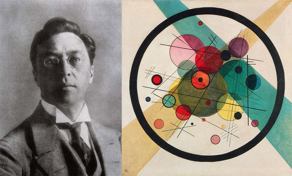
Kandinsky’s teachings, books and theories are still studied today and while we may question his artistic works, it was Kandinsky who wrote the first groundbreaking theories behind psychology and visual experience. He is a pioneer in relating what is seen on a canvas, wall or page to how a human mind will react. This very principle is fundamental to graphic design.
Cubism, Constructivism & Suprematism
Kandinsky was from Russia as was the massively important artistic movement ‘Constructivism’, though it would be wrong to call Kandinsky a Constructivist artist. In fact, his abstract works have been described as an expression of Kandinsky distancing himself from Constructivism and Suprematism.
Constructivists believe art had to have a direct purpose, a message. It’s not hard to see how this had a profound influence on the development of graphic design. Artworks would be created to promote political messages, direct people to events and advertise products.
Suprematism, another Russian art movement focused on basic geometric shapes and the relationship between a person and that shape. You can really see the seeds of graphic design fundamentals such as logotypes, iconography and semiotics taking shape here.
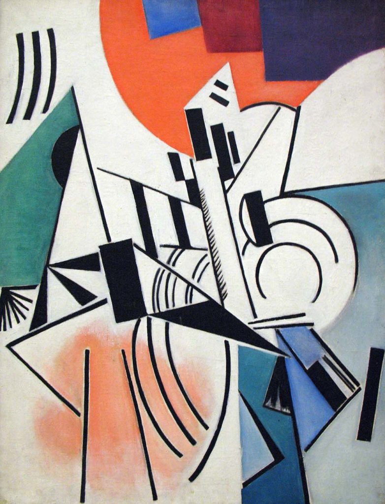
While these strong, shape and purpose orientated art movements were emerging from Russia, abstract works and art focussed on geometry, planes, shapes and lines were also flooding out of France. Many would say Cubism is the most influential art movement of the 20th century and when we drop artists names such as Pablo Picasso, it’s not hard to see why.
Cubism is described as a representation of three-dimensional form, the artist depicts the subject from a multitude of viewpoints to represent it in a greater context. Cubism, Constructivism and Suprematism evolved together and all had a profound influence on how shape, geometry and colour provoke a psychological human response.
Dada & Surrealism
You might be seeing a theme here; the turn of the century brought many radical new art movements. Constructivism and Suprematism had roots in Futurism and were in the making before the first world war but were of course greatly affected by it.
Dadaism was a direct result of rebellion during and following the oppression of the first world war. As a result of the strict law and order opposed by World War 1, Dadaism aimed to reject logic and reason in favour of nonsense. The movement emerged from Zurich in Switzerland and had notable characteristics including plenty of humour, collage-style artworks and general far-left political messages.
In the early 1920′s, Dadaism evolved in Paris into Surrealism. Where Dadaism was focussed on absolute nonsense sometimes with a political undertone, surrealists claim their work to be largely an expression of philosophical movement. The works are characterised for the most part by paintings containing striking juxtapositions, elements of surprise and again, nonsensical imagery.
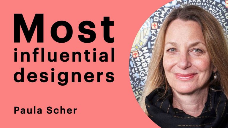
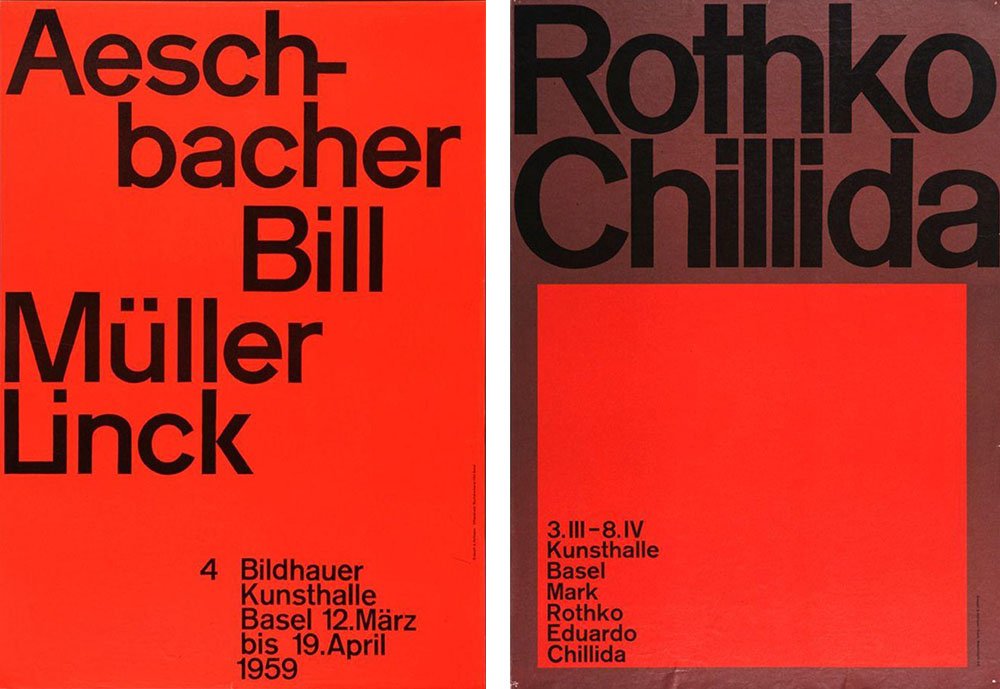
Brockmann
Joseph Müller Brockmann is one of my favourite graphic designers from history. Brockmann was a Swiss graphic designer and his work literally defines graphic design for me. He took Kandinsky’s geometric theories, Johannes Itten’s theory of colour, the influence of Bauhaus and early Modernism, the influence of Constructivism, Suprematism and Cubism and the collage making of Dadaism and (arguably) turned it into the first comprehensive body of graphic design works.
Graphic design as we know it today can be seen clearly in Brockmann’s work. His written works such as ‘Grid Systems’ and ‘The History of the Poster’ are invaluable graphic design handbooks still used thoroughly today. That is of course if you are passionate enough about your work to shell out £80 on a very concise little 41-year-old book. I’m proud to say I have a copy of ‘The History of the Poster’ sat beside me as I type.
Brockmann wrote these fundamental texts later in his career but it was his earlier involvement with the birth of Swiss Style or ‘The International Style’ that would earn him his throne in the hall of graphic design royalty.
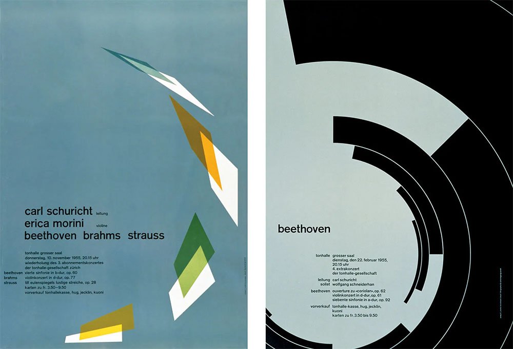
Swiss Style or ‘The International Style’
Following the second world war, a certain aesthetic emerged from Switzerland. Dubbed ‘Swiss Style’ or ‘Swiss Design’ the graphic design at the time was focussed on legibility, clarity, symmetry and form. It stressed an absolute and universal style of graphic design. In graphic design terms ‘Modernism’ is epitomised by the Swiss Style.
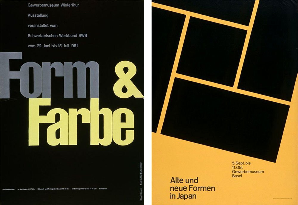
Armin Hoffmann
In order to explain exactly what Swiss Style is I’ll need to introduce you to a few legendary graphic designers; Firstly Armin Hoffmann. Hoffmann taught typography in his hometown at the Basel School of Design.
He has been described as “The best Typographic designer ever.” Typography is a vitally important part of Swiss Style, Modernism and graphic design as a whole. His style does not rely on colour for emphasis or theme, instead, it leans heavily toward the use of typographic hierarchy, size, semiotics and iconography. Hoffmann suggests a ‘trivialisation of colour’ led to this particular style.
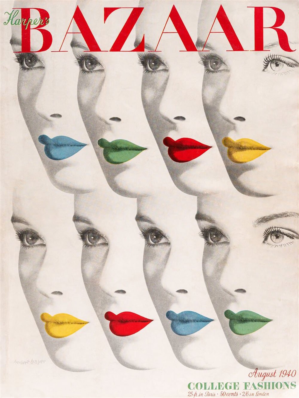
Alexey Brodovitch
Brodovitch was the master of white space. He was an influential photographer, artistic director and editorial designer. Brodovitch drew inspiration from Surrealism, Dadaism and all the other strange kinds of art going around at the time.
Brodovitch’s most prominent role was that of artistic director for Harpers Bazaar. He designed the iconic Bazaar logo using the font-family ‘Didot’ which is now a standard for fashion magazines and any typography associated with fashion.
Paul Rand
A well known American graphic designer. Rand is best known for his corporate logo design. It’s not hard to see why his logo work is reflected in most modern corporate design. His work really does speak for itself. Yale, IBM and UPS still use the logo’s he designed for them back in the 50′s & 60′s.
“He (Rand) almost singlehandedly convinced businesses that design was an effective tool. [. . .] Anyone designing in the 1950s and 1960s owed much to Rand, who largely made it possible for us to work. He more than anyone else made the profession reputable. We went from being commercial artists to being graphic designers largely on his merits”.
Louis Danziger – Graphic Designer

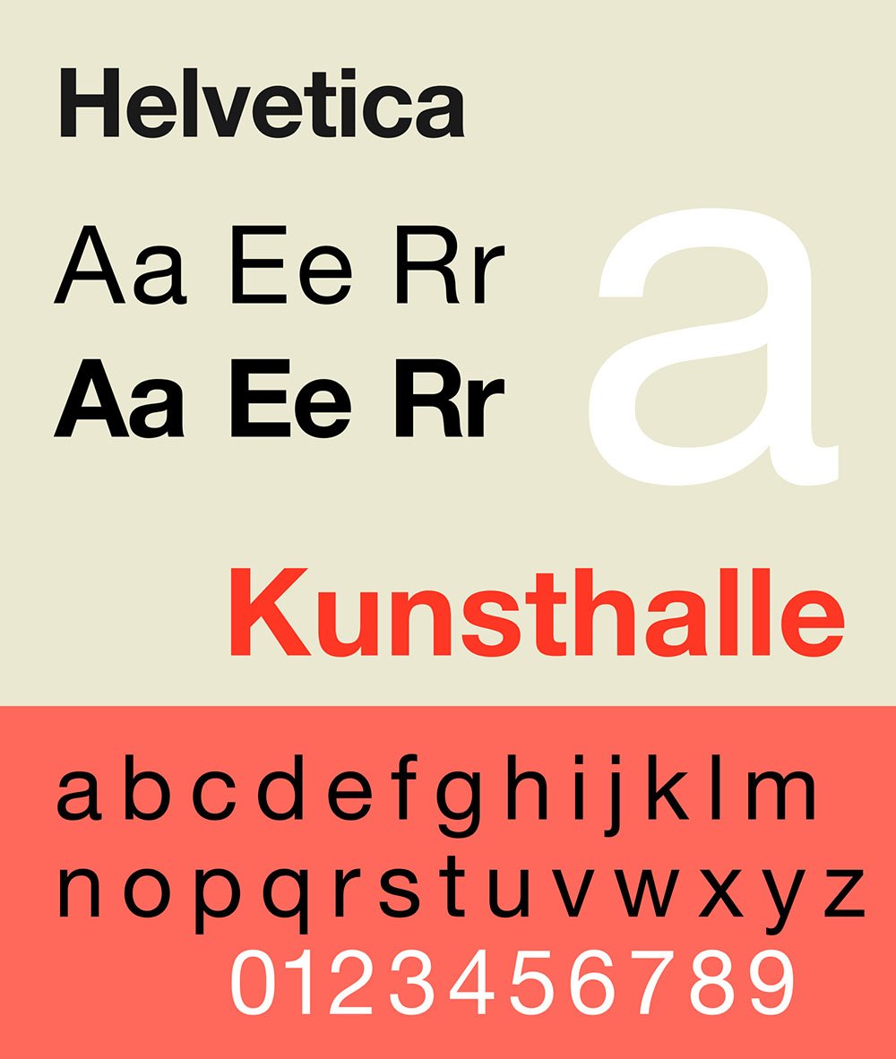
Helvetica
It’s well known that Helvetica is regarded as a graphic designer’s best friend, but why? Helvetica was designed to compete with ‘Akzidenz-Grotesk’ – a popular swiss typeface being used heavily by designers wanting to achieve that ‘Swiss Design’ aesthetic, which was becoming extremely popular with emerging companies in the USA. Helvetica was designed by Max Meidinger and Eduard Hoffmann in 1957 for the ‘Haas Type Foundry’ in Switzerland.
Originally called Neue Haas Grotesk, the typeface was renamed by Haas Type Foundry’s sister company (Stemel) to appeal to the American market. ‘Helvetica’ comes from the Latin for ‘Swiss’ – which explains its initial popularity. But what is it about the typeface that makes it so useable? Helvetica is a geometric font, it’s mathematically calculated in terms of letter spacing and form; this makes it a very tidy, neat font.
If you look carefully you’ll notice that all the letter’s terminals (the edges at the very ends of letters) are either horizontal or vertical, again, adding to the typefaces neatness. Helvetica is also designed, purposefully not to give any meaning through its form. So where a spiky font would give off connotations of danger or fear, Helvetica presents itself plainly, with no intrinsic message.
In the same way, Alexey Brodovitch decided not to use colour to give meaning, Helvetica gives the designer the option not to use typeface to give meaning, instead, allowing them to be more creative with size, image, semiotics, colour, composition and iconography. Helvetica defines Swiss Style and made the popular look universally accessible.
Postmodernism
As with every turning point in the history of art & design we see more rebellion, this time in the 1980′s with the birth of Postmodernism. Postmodernism is mostly a rejection of Modernism. The logical, legible, clean, structured aesthetic of Modernism is rejected by Postmodernism in favour of abstract form, peculiar shapes and crazy typefaces.
Unlike Surrealists and Dadaists, Postmodernists reject the style of their predecessor for a very valid reason, that it is impersonal, not humorous and simply not fun.
So where Modernists said “form follows function”, Postmodernists said, “function follows form”. They created things that they thought looked nice, exciting or interesting and dealt with their function later. It is their argument that graphic design’s purpose is to draw attention to a piece of work before instructing the intended action of said work.
Postmodernism certainly had an effect on the graphic world, it was the look of punk and anything ‘alternative’ today seems to take design inspiration from it. Ironic really that there is a pre-defined look for rebellion.
The digital age of design
1990 brought the birth of Adobe Photoshop (along with other digital tools) exclusively for Macintosh computers, ever wondered why graphic designers always use macs? Well, that’s where it started at least. 1990 also brought grunge, another rebellious cultural movement for which Postmodernism would give a big aesthetic hug.
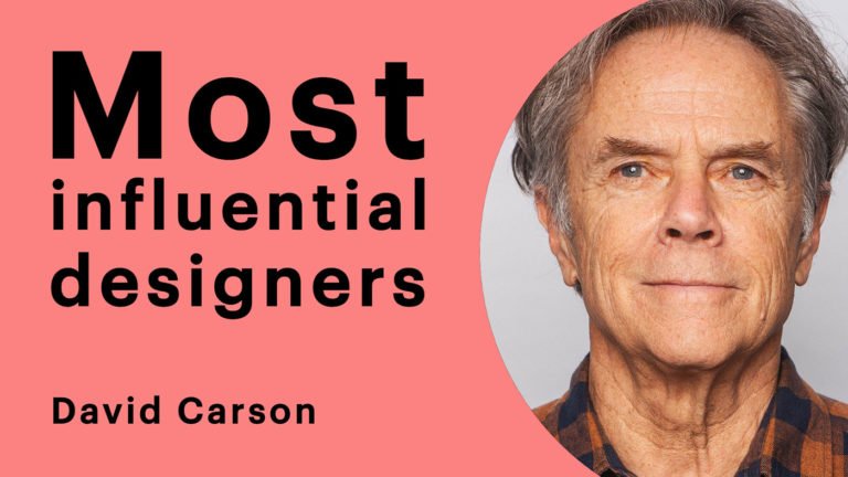
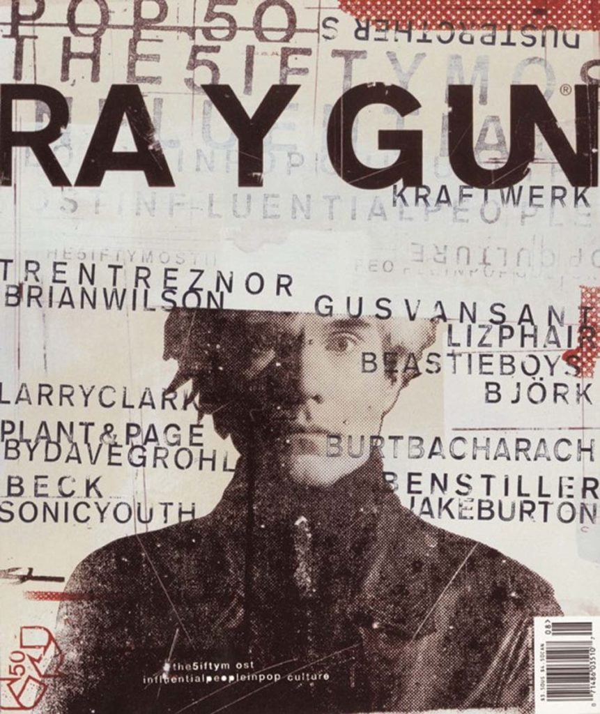
David Carson
Carson is most certainly one of the most important, influential and well known post-modern graphic designers. He took the unconventional and theory challenging themes from Post-Modernism and applied them to the 90′s.
Carson was producing work and gaining recognition before the decade began but the emergence of grunge and the growing popularisation of skateboarding & surfing clearly influenced Carson’s work, giving him the style he is famous for and still works with today. Carson’s work with the magazine Ray-Gun could be described as style-defining for the 1990′s.
Elsewhere in the 90′s
I mentioned the birth of Photoshop, which needs no explaining regarding its importance to graphic design. A few other things happened in the 90′s, many of them difficult to talk about especially when mentioning designers themselves, it’s difficult to say how important someone is until some time has passed and we can look back in retrospect.
Grunge had an influence across the board, it was now fashionable not to care, looking a bit of a mess was in and organisation was out. This can be seen in things as un-grungey as the hit 90′s sitcom Friends. Look at that typography, wobbly, out of line, out of the grid, it simply doesn’t care.
The birth of the internet also had a great influence on design, with many graphic designers experimenting with web design and influencing its development and progression to today’s styles and conventions.
Apple’s influence on Design
The early to mid 90′s saw a dip in Apple’s popularity and subsequently their profits. In 1997 Steve Jobs came back to Apple as interim CEO and began re-shaping the product line. As the decade was burning out, in 1998, something big changed in the tech world.
Apple successfully turned their product line around. They released the first iMac, bought Macromedia Final Cut which would become Final Cut Pro, the standard for video editing software which we use here at D5 Media on a daily basis. This purchase meant Apple could also release Final Cut Pro’s baby brother iMovie which started their popular iLife and iWork products. But what did this mean for design? Jobs’ logic was very reminiscent of Modernism, things would be created to work, not just to look good. This is reflected in their logo change in the same year, before 1998 Apple sported the rainbow-coloured logo. To a non-designer, this may not seem like such a profound change, though this change would bring the next era of design.
Neo-Modernism
As I mentioned before, talking about recent history is always dangerous, especially in a subject such as design. Things are constantly changing, evolving and re-shaping, this not only has an effect on what we see now but how we interpret the recent past. A reflection of this would be the term ‘Neo-Modernism’, this is a debated topic but the theory I feel is the strongest.
After the 1980′s mayhem and early to mid 90′s carefree attitude we see a big change in design which is often called ‘Neo-Modernism’ or ‘New Modernism’. This change can be pinned to 1997 and 1998, Apple’s advancements had a huge impact on the design world in 1998 and 1997 saw the architectural evolution from Post-Modernism to Neo-Modernism.
Neo-Modernism is described as Modernism’s criticism of Post-Modernism. Reestablishing the logic, structure, design theory, colour theory of Modernism and taking it to new extremes. This aesthetic is the hyper-minimal style that is commonly regarded as ‘sleek’ and ‘stylish’ today. Logo’s, branding, type hierarchy and grid systems are back with a vengeance.
It’s difficult to pin this style to particular designers with it being so recent. I will however try to explain the current situation using designers I feel are the most influential; having influenced me. Though who can tell until the next generation of designers emerge and we can analyse their influences and come to some sort of conclusion on the whole ‘Neo-Modernism’ thing.
M/M (Paris)
A partnership was established in Paris, 1992 by Mathias Augustyniak and Michael Amzalag. M/M (Paris) are hugely successful graphic designers, art directors and advertising designers. Their style is clear, concise and beautiful (my opinion). It is a strong example of Neo-Modernism. M/M are key players in the creative world and have racked up clients including Les Inrockuptibles, Vogue Paris and Purple Fashion but are most famous for their work with musicians such as Björk, Madonna, Benjamin Biolay, Etienne Daho, Jean-Louis Murat, Mew and Kanye West. Their style encompasses and is inspired by graphic designers throughout the whole evolution of the field.
Neo-Modernism has been described as a criticism of Post-Modernism but I have to say, I would definitely call M/M (Paris) Neo-Modernists in the same breath as describing their Post-Modern influences. So not necessarily a harsh criticism but a re-application of Post-Modernism within Neo-Modernism. Their work has been celebrated in exhibitions in New York, London, Stockholm, Tokyo and of course Paris.
“An image never interests us as such. Its relevance lies in the fact that it contains the sum of preceding dialogues, stories, experiences with various interlocutors, and the fact that it induces a questioning of these preexisting values. This is what makes for a pertinent image. A good image should be in between two others, a previous one and another to come.”
M/M
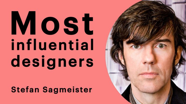
Stefan Sagmeister
Another hugely influential modern graphic designer is Stefan Sagmeister. Having started his career at the tender age of 15 working for the Austrian youth magazine Alphorn, Sagmeister has had a long and healthy career adding names including The Rolling Stones, The Guggenheim Museum, HBO, The Talking Heads, Lou Reed and Time Warner to his portfolio.
Sagmeister lives and works in New York and has recently joined forces with Jessica Walsh, an award-winning multidisciplinary designer, together they are Sagmeister and Walsh, their work certainly encapsulates what I would call ‘Neo-Modernism’. Again, the best way to get a feel of their work is to simply look at it, having read and understood this brief history, it’s easy to see their influences and importance in the creative world.
“It is very important to embrace failure and to do a lot of stuff — as much stuff as possible — with as little fear as possible. It’s much, much better to wind up with a lot of crap having tried it than to overthink in the beginning and not do it.”
Stefan Sagmeister
Jonathan Puckey
To bring us right up to date I’d like to use Jonathan Puckey’s work as an example. Puckey is an innovator in the use and creation of design tools. Working from his studio in Amsterdam, Puckey’s works are striking, stylish and very in touch with modern trends. The notion of designs consisting of 50% artistic human input and 50% computer programs such as Puckey’s tools could be compared to the grid systems of Joseph Muller Brockman and the ‘International Style’. Both techniques involve intelligent design but suggest a uniform idealism.
Futurology
It’s quite simple to describe what futurology is and what futurologists do. They predict the future, in terms of design trends that is. An organisation such as WGSN employ futurologists to analyse design trends, history and patterns in order to accurately predict how the future will look in terms of fashion, product and graphic design.
Companies and designers pay large amounts of money to access this information and It is a common viewpoint that these organisations are so popular they have almost monopolised the future, whether this is good or bad is entirely subjective. WGSN for example produces extensive style, trend and colour forecasts which are then followed by the leading designers, high street stores and product developers. Their predictions are often very vague, speculative and outlandish which could be seen as inspiration rather than futurology.
Personally, I believe the aesthetic of the future is still being shaped in the same way it always has, futurologists are simply another element in the vast world of creativity. They do however provide a useful tool and insight into what everyone will be doing in the coming 4 years which is almost guaranteed.
Metamodernism & N.D.A
Two of the terms that keep cropping up in futurologists spheres are ‘Metamodernism’ and ‘New Digital Aesthetic’. Metamodernism is described as;
“A new name for a new world – Metamodernism. The movement, which is still in its early days, has evolved from both modernism and post-modernism. Expect it to define the decade ahead. With a romantic enthusiasm for the future, it is characterised by the push and pull between opposites, between contradictions and the seemingly incompatible.”
And N.D.A is described as;
“The way we look at the world is changing. As we spend more time viewing life through the prism of our iPhones, cameras, tablets and computers, the way these machines “see” and the way we see are becoming intertwined. A machine does not differentiate between the animate and the inanimate, the beautiful and the ugly. This is influencing the aesthetic of design today.”
Bruce Sterling
From this, we can see how vague and unspecific these predictions are. Though we can still differentiate between the aesthetic of now and the one predicted by futurologists. This leaves it open for designers to interpret the information any way they see fit.