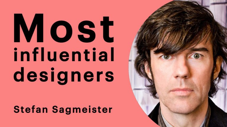
Most influential designers #9 Chip Kidd

This is the second part of a ten-part blog series, if you missed the first part, read it here. As part of their 50th-anniversary survey GDUSA published a top ten list of the most influential graphic designers working today (amongst other creative professions).
I’m going to work, in reverse order, through these top ten designers and establish just what it is that makes them so damn great and more importantly display some of their best works.
Who is Chip Kidd?
Kidd’s life story may at first seem to encapsulate the very opposite of what we expect from an artist, over the last 27 years, he has risen through the ranks at Knopf from Junior Assistant to Associate Art Director, the sort of career ladder climbing often entirely dismissed by graphic designers in favour of an idealistic bohemian wanderlust type journey through life’s experiences.
Though that’s not to say he hasn’t ticked some of the arty boxes contributing toward the quintessential designer story. He has received a; National Design Award for Communications, the Use of Photography in Design award from the International Center of Photography, “And a bunch of other stuff” as it states on his website. He also works out of New York City, as do the majority of this top ten list.
His work has been described as “a revolution in the art of American book packaging” which is reflected in his client list which includes; Amazon, Doubleday, Farrar Straus & Giroux, Grove Press, HarperCollins, Penguin/Putnam, Scribner and Columbia University Press.
The man himself is typically eccentric and has the sort of character that is endearing yet polarises personal judgement. Though he has worked on book packaging for a range of genres it is clear that his true passion is with the comic book medium. Let’s take a look at some of his most famous works: (bearing in mind, when Kidd first started at Knopf, he was churning over 75 covers a year so we’re clearly not even going to scratch the surface).
Chip Kidd book cover designs
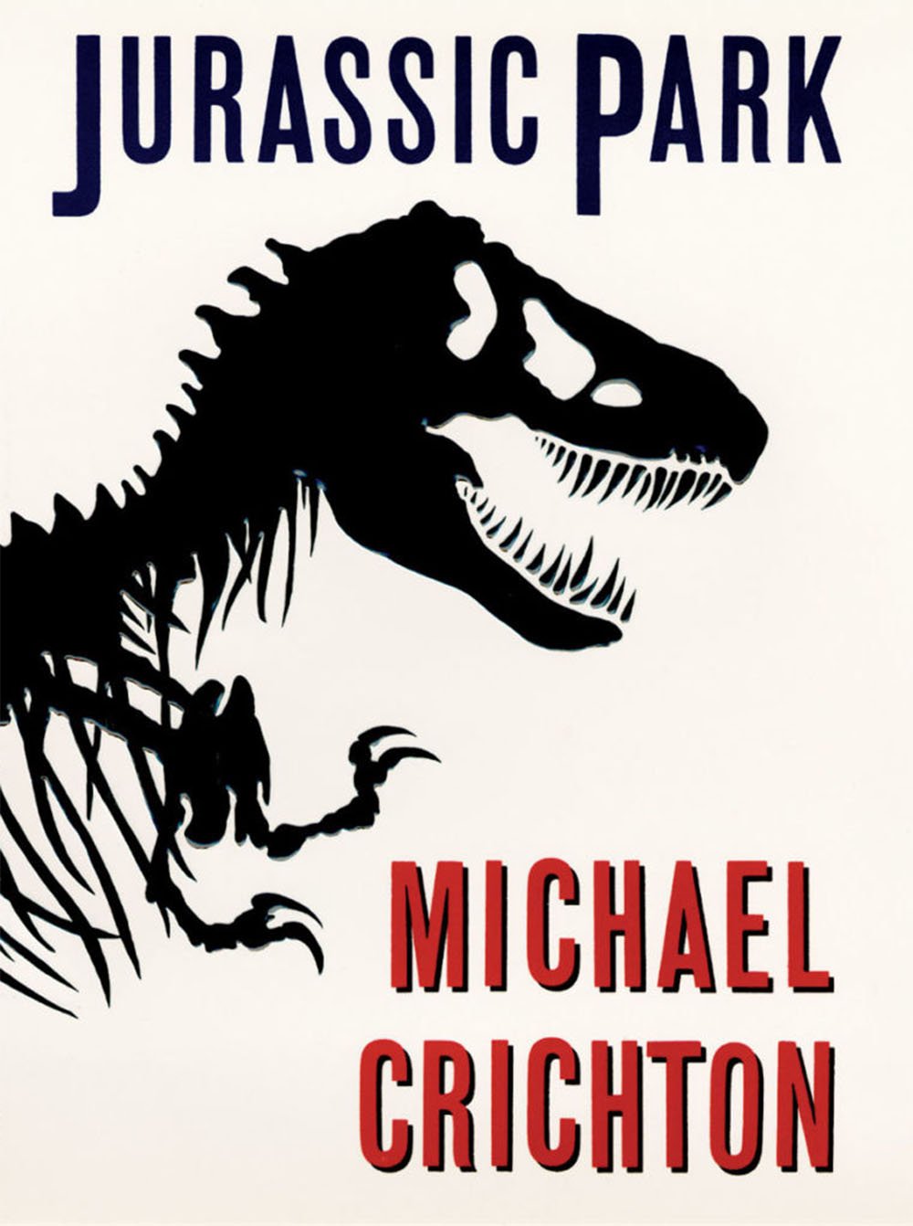
“When trying to recreate one of these creatures, all anyone has to go on is bones, right? So that was the starting point…Not only was the drawing integrated into the movie poster, but it also became the logo in the film for the park itself…Ultimately, I think it’s safe to say that the Jurassic Park T-Rex became one of the most recognizable logos of the 1990s…[For the sequel], the solution was to take the original art and use it in a different way. There was no need to redraw anything.”
Chip Kidd
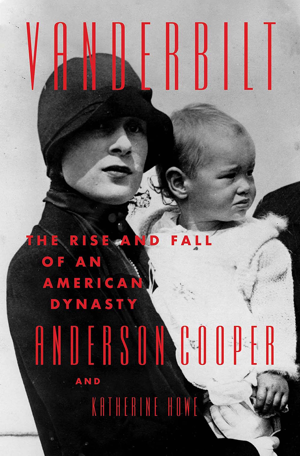
“An epic story of one family’s struggle to survive in the heart of the world’s greatest city at this most symbolic of eras, I knew that it had to convey the sense of one grand epoch ending and giving way to the next. The result is both familiar and futuristic.”
Chip Kidd
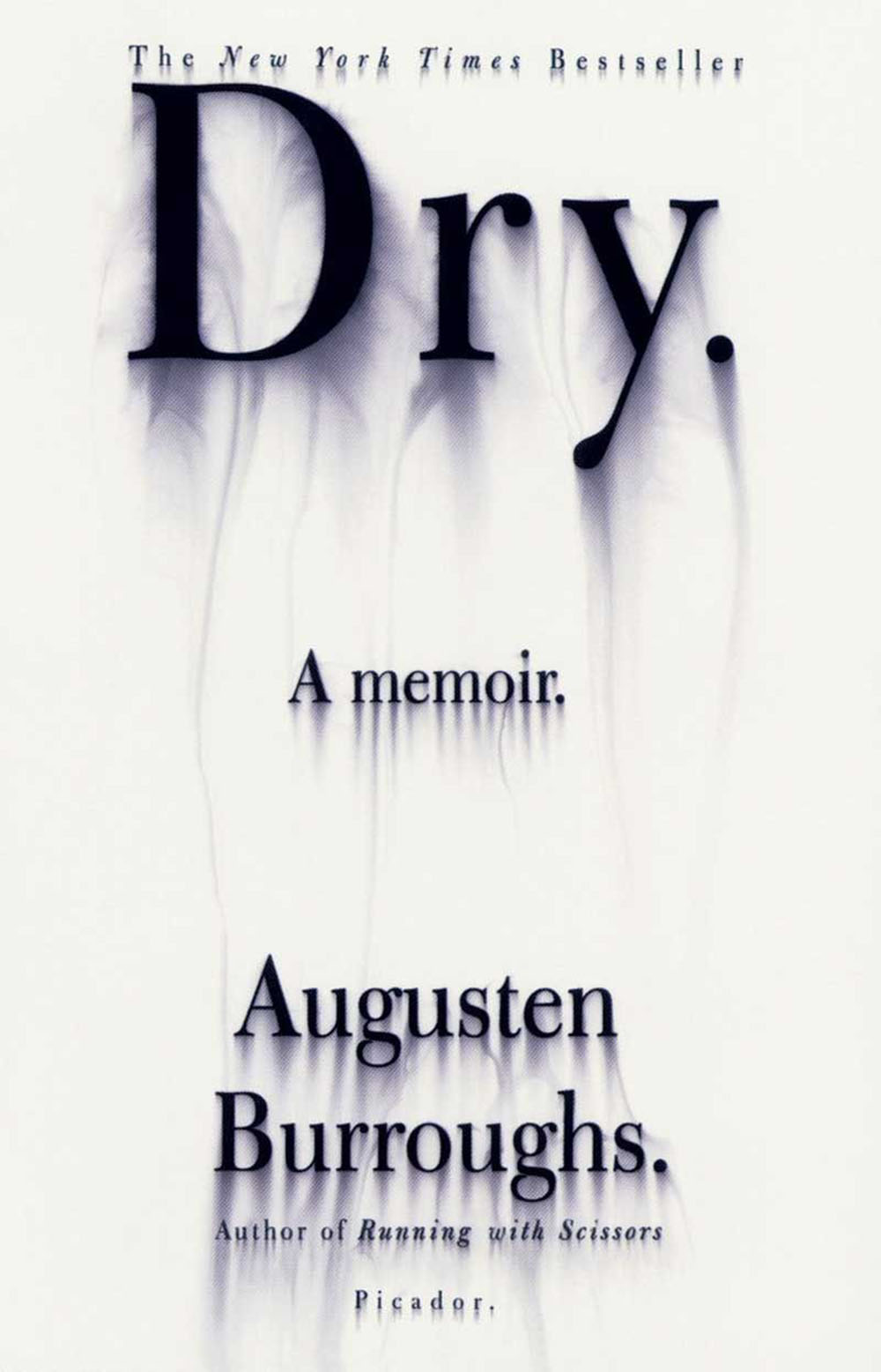
“I was touring for the paperback of Dry. And I was in an airport bookstore, looking for something to read on the plane. I noticed that the store had only one copy of Dry on the table, and I thought, that’s probably a good sign. And as I was standing there, a woman picked up the book, looked it over, and brought it up to the clerk. She said, “Excuse me, do you have another copy of this book? This one looks like it got all wet.” The clerk said, “No I’m sorry. All of them were wet like that.” So the woman PUT THE BOOK BACK and left the store, frowning. I felt so smug and satisfied.”
Chip Kidd
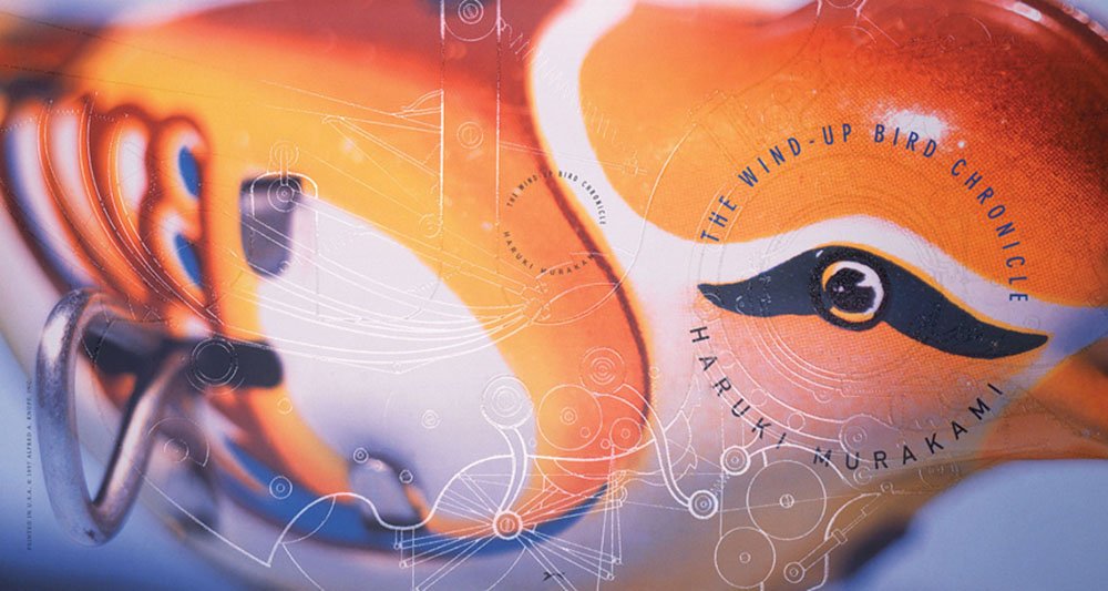
“The Wind-Up Bird Chronicle was the most ambitious and intricate design for a work of fiction I’d ever attempted…While I usually loathe to go so literal with title and imagery, the idea was to make the device on the jacket so relatively large that it can’t be perceived as a whole when wrapped around the book and so becomes completely abstracted.”
Chip Kidd
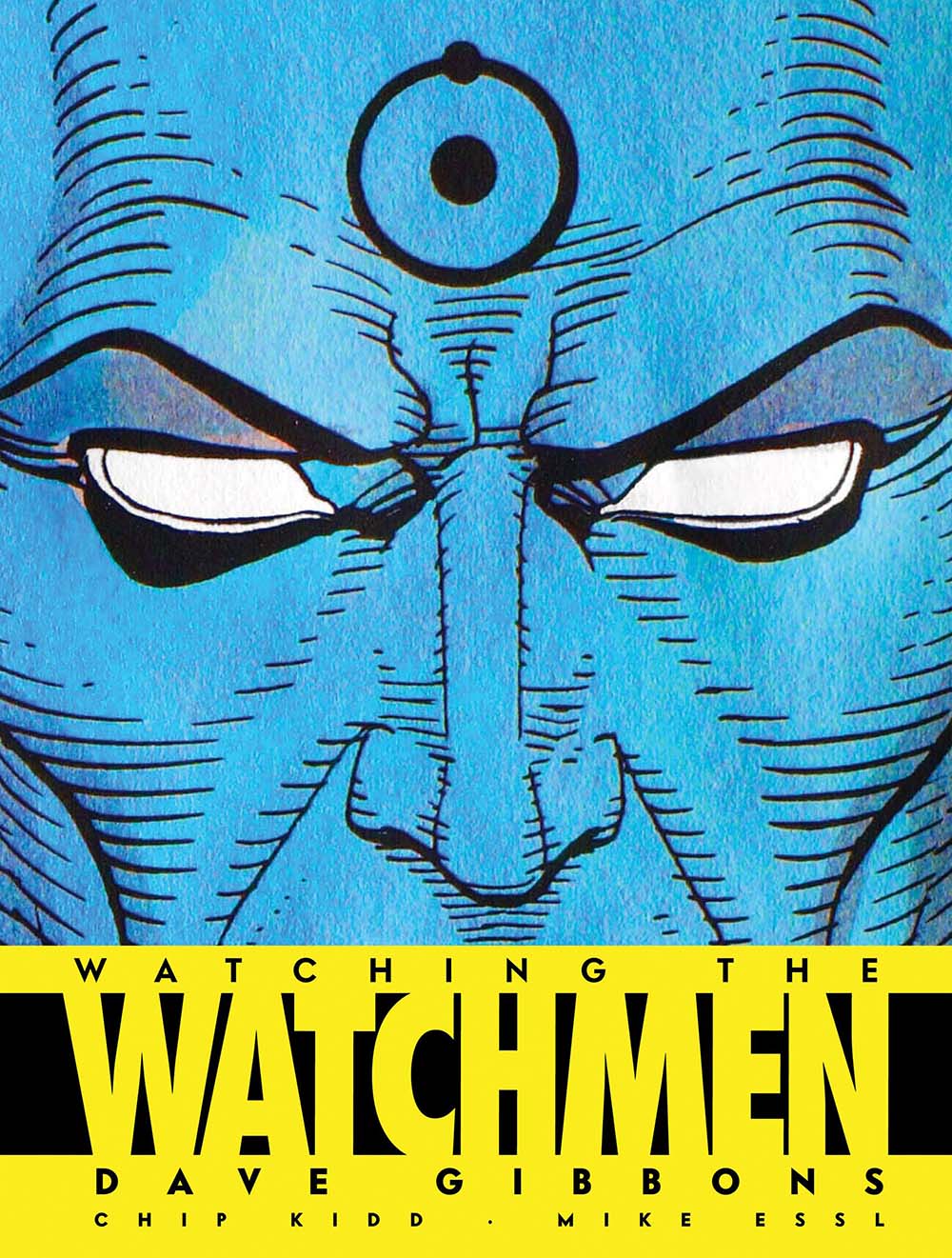
Chip Kidd’s style is outstandingly bold, prominent and undoubtedly his own, he certainly deserves his place on the list. He also happens to be quite hilarious, check out his Ted Talk on book cover design.
