Most influential designers #3 David Carson

This is the eighth part of a ten-part blog series, if you missed the first part, read it here. As part of their 50th-anniversary survey GDUSA published a top ten list of the most influential graphic designers working today (amongst other creative professions).
I’m going to work, in reverse order, through these top ten designers and establish just what it is that makes them so damn great and more importantly display some of their best works.
Who is David Carson?
Personally, as a spokesperson and figurehead of post-modernism, I couldn’t feel less empathetic with the life works and career of David Carson, that said, I’ll try to set aside my biases and explain his influence on modern graphic design.
Essentially Carson’s graphic persona is the antagonist to the modernist designer’s protagonist, it might resemble the complete opposite in terms of style, application and methodology but, in my opinion, it provides a sort of necessary evil that any logical designer should respect and be very much aware of. Carson’s output is often predictably unpredictable, illogically logical and organised chaos.
Carson was born in Texas and graduated from San Diego State University with a degree in Sociology, after that he became the 9th best surfer in the world (1989) and worked in a high school as a teacher. Certainly not the typical path into the design industry. He did, in 1980, study a two-week course in design at the University of Arizona and in ’83 attended Oregon College of Commercial Art where he began to experiment with design.
Carson made his name in design through skateboarding, surfing and snowboarding magazines during the 80′s. The most notable of which include, Transworld Skateboarding, Spinoff and Transworld Snowboarding. In this stint of 80′s extreme sports magazines, Carson coined and developed his grungey typographic style, often obscuring and distorting letterforms and pictorial elements to make the output intentionally illegible.
While these magazines made his work known in the communities they involved as well as niche corners of the creative industries, it wasn’t until publisher Marvin Scott Jarrett commissioned Carson to design Ray Gun, an alternative music and lifestyle magazine that debuted in 1992. Ray Gun made Carson well known and attracted new admirers to his work. In this period, he was featured in publications such as The New York Times (May 1994) and Newsweek (1996).
During his time at Ray Gun, Carson famously set an entire article in the Dingbats font, the article was entirely unreadable. Personally, I find this to be a complete train-wreck of a gimmick, the sort that would be thought up by an ageing ad man, running really low on ideas, but that’s just me. Ray Gun’s editors put a readable version in the back of the magazine too, so what was the point, really? Sorry, I’m trying to be indifferent, honestly.
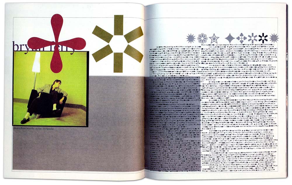
Carson left Ray Gun in ’95 and founded ‘David Carson Design’, in NYC. His Ray Gun shenanigans attracted a whole host of clients including Pepsi Cola, Ray-Ban, Nike, Microsoft, Budweiser, Giorgio Armani, NBC, American Airlines and Levi Strauss. In 2000, Carson closed his New York City studio and followed his children to Charleston, South Carolina, where their mother had relocated them.
Since then, he’s worked as the Creative Director of the Gibbes Museum of Art in Charleston and directed a television commercial for UMPQUA Bank in Seattle, Washington among other freelance projects.
Today, Carson lectures, teaches and holds workshops.
On the one hand, graphic design is a form of communication and devoting your career to obscuring the medium seems counter-productive and even offensive to those that believe in such ideals. On the other hand, graphic design is an art form, which is notoriously shaped by the underground and avant-garde, often taking extremism and the obscure to change its shape and appearance.
“He significantly influenced a generation to embrace typography as an expressive medium”.
Steven Heller
Carson’s work is of a definite style, that we cannot deny, it is unique, exciting, colourful and vibrant. It has its place in the history of design and defines an era. Which is undoubtedly what led to his inclusion on the list.
Carson’s outputs are often great, attractive pieces of design, for me, the problem is, they always communicate the same message; chaos, a message inappropriate for much of the work produced. That said, the grunge and chaos do now have their place, without designers like Carson and the people he’s influenced, those messages may have been communicated very differently.
To hopefully balance out my inevitable cynicism when discussing Carson, I’ll quote a supporter of his when describing his work, get ready for some bold claims:
Legend is a term that is all too often abused when describing a successful individual, but in the case of graphic designer David Carson, it’s just one of many superlatives you could use: Innovator, pioneer, groundbreaker, game changer – Carson deserves them all.
Through his seminal, groundbreaking work for Ray Gun magazine during the ’90s, Carson single-handedly shook up the world of graphic design – often placing more importance on the visual composition of the pages than on the text itself. He was never far from controversy, upsetting the purists with his unorthodox approach – once finding an interview with Bryan Ferry so boring that he used dingbat for the entire piece.
Such is Carson’s legacy (and he’s long way from being done, yet), that everywhere you go you can see his influence – whether it’s on the front cover of a mainstream or indie publication orin the opening credits of a mainstream film. Without doubt, David Carson’s work will be here long after the talented surfer (yes, he surfs, too) has rode his last wave.
David Carson Posters
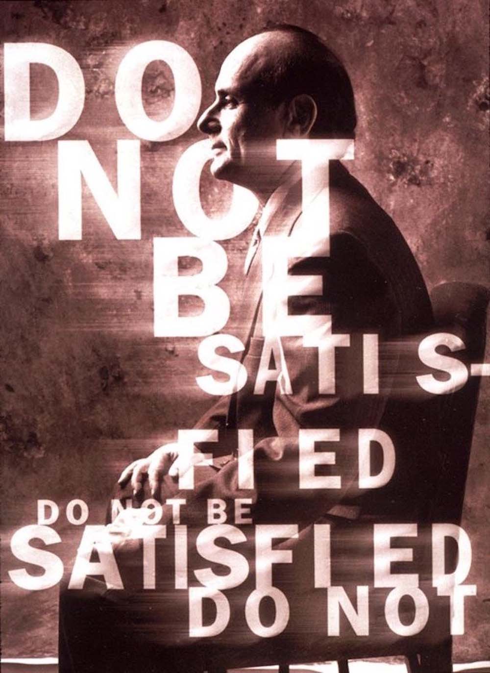
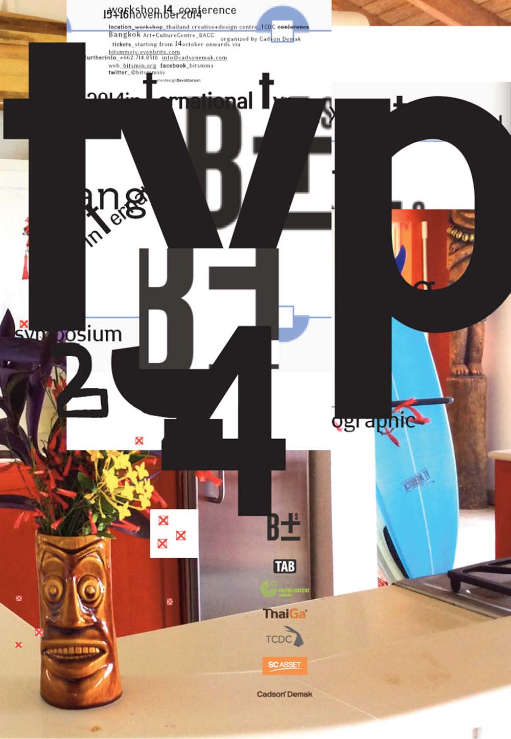
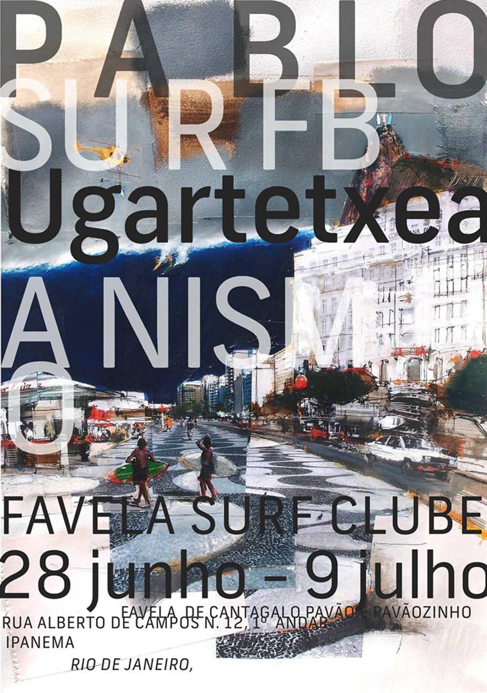
David Carson Ray Gun Covers
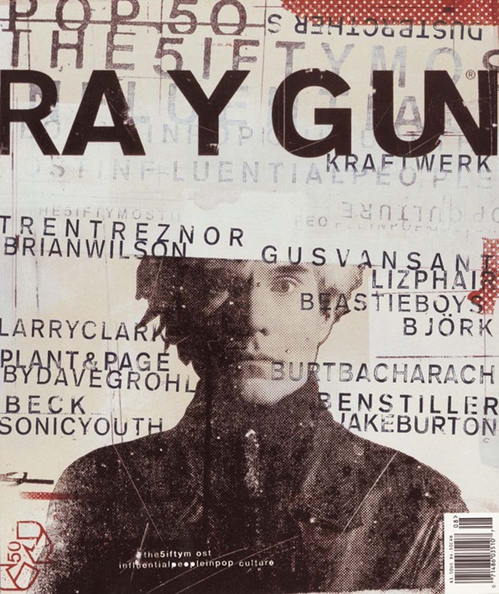
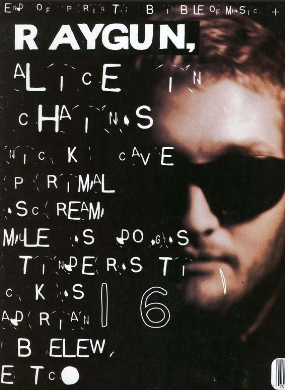
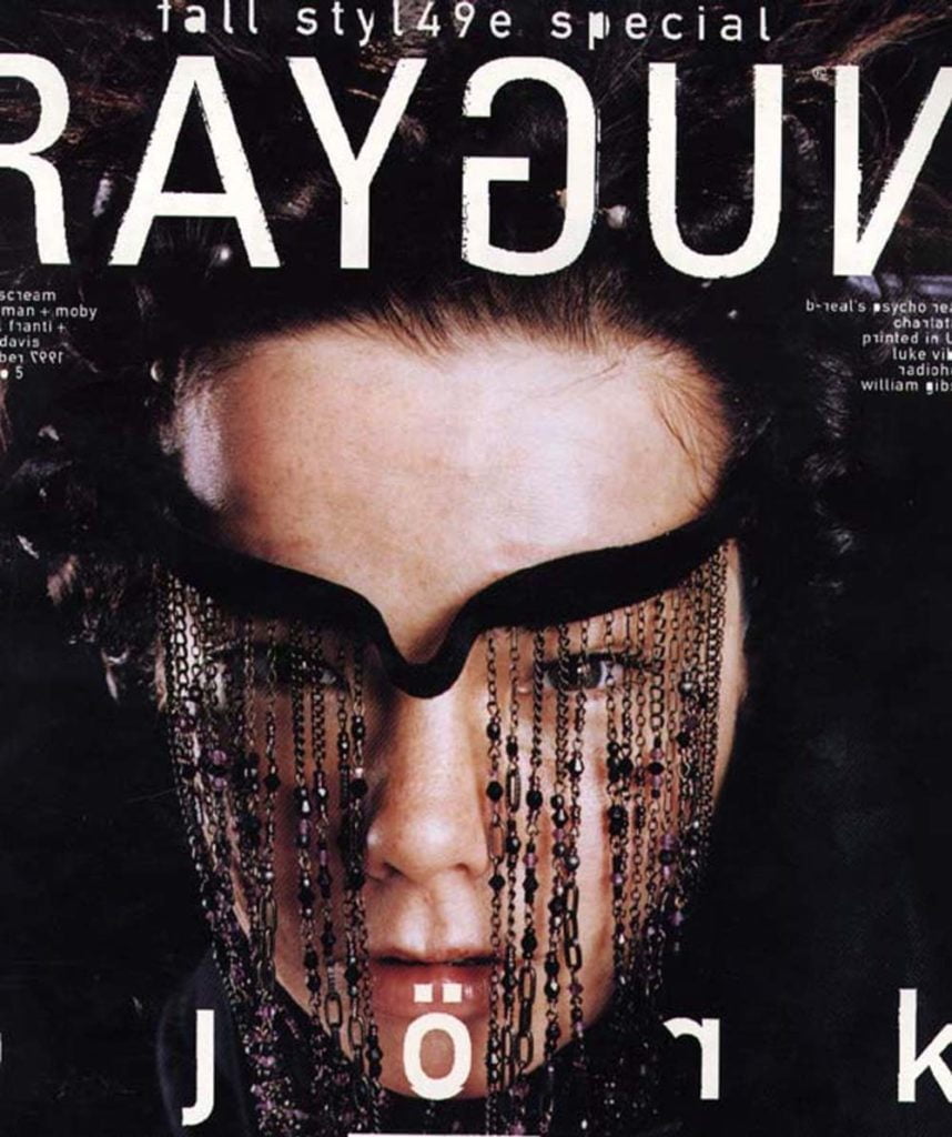
Next week we’ll be looking at Paula Scher, Lady principle at Pentagram.
